
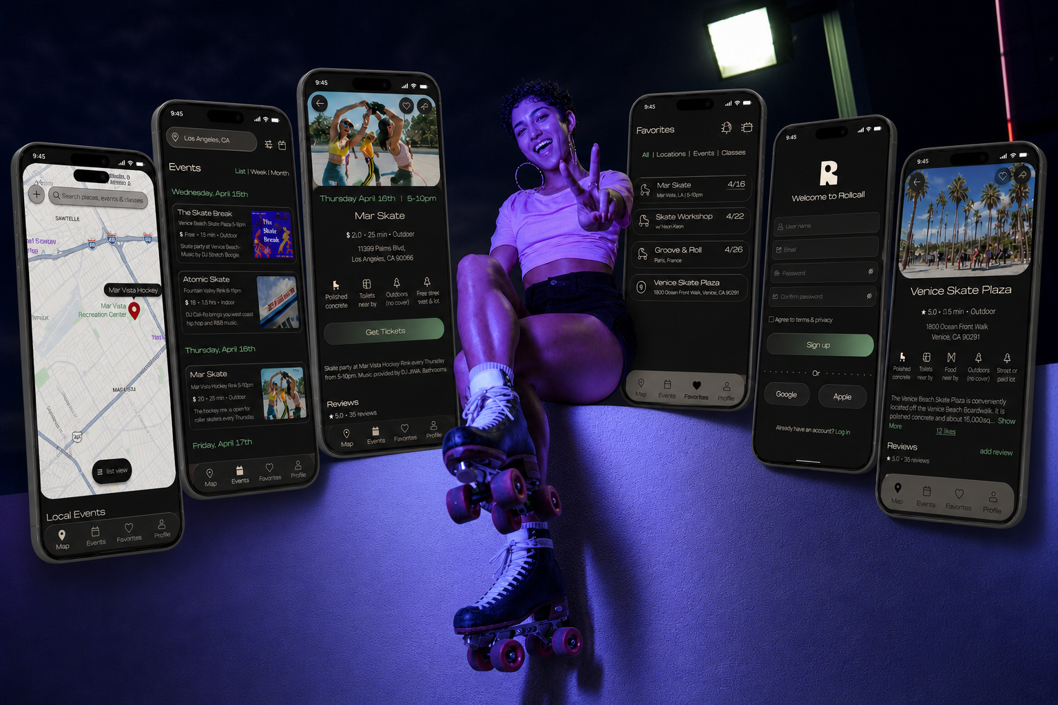
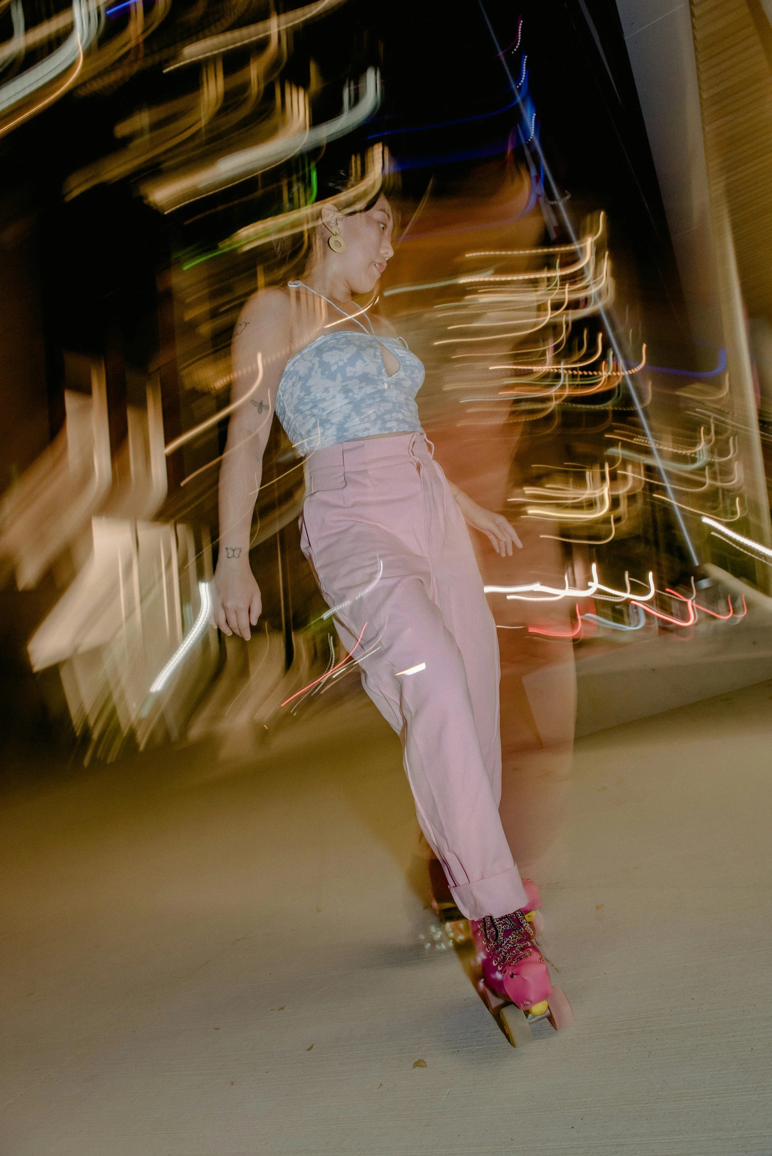
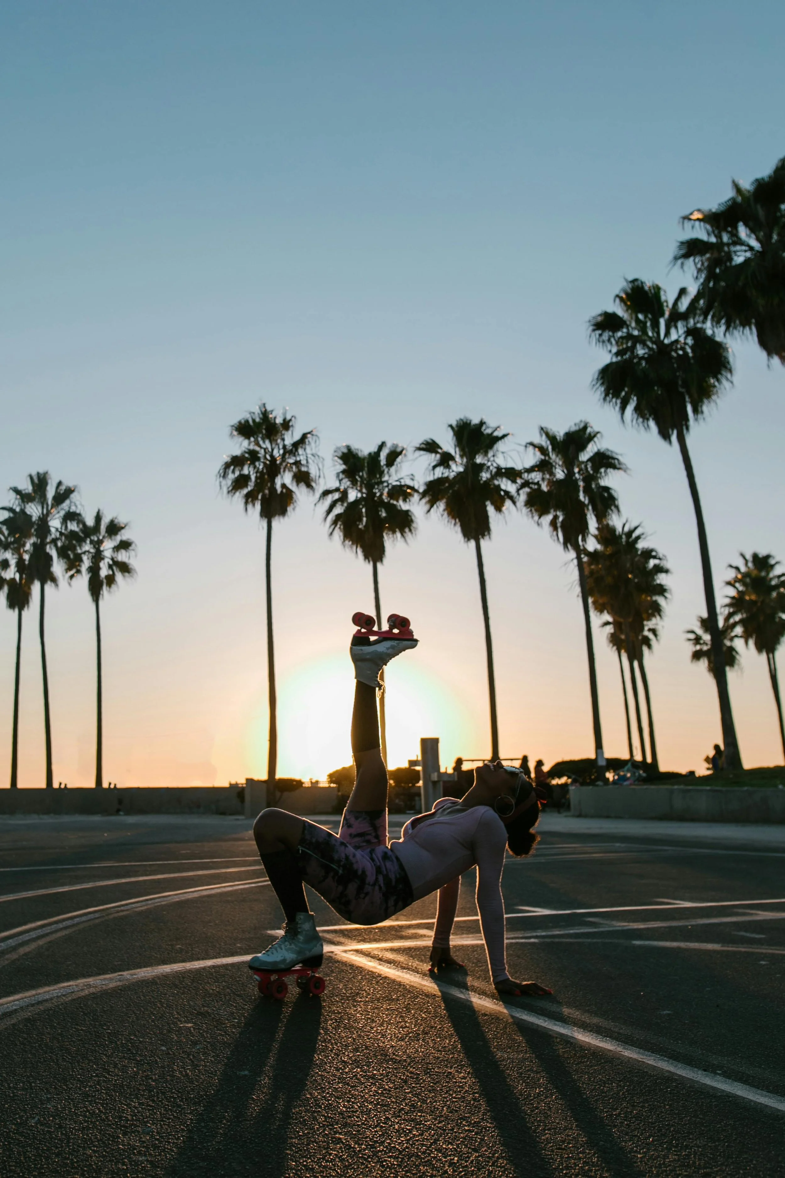
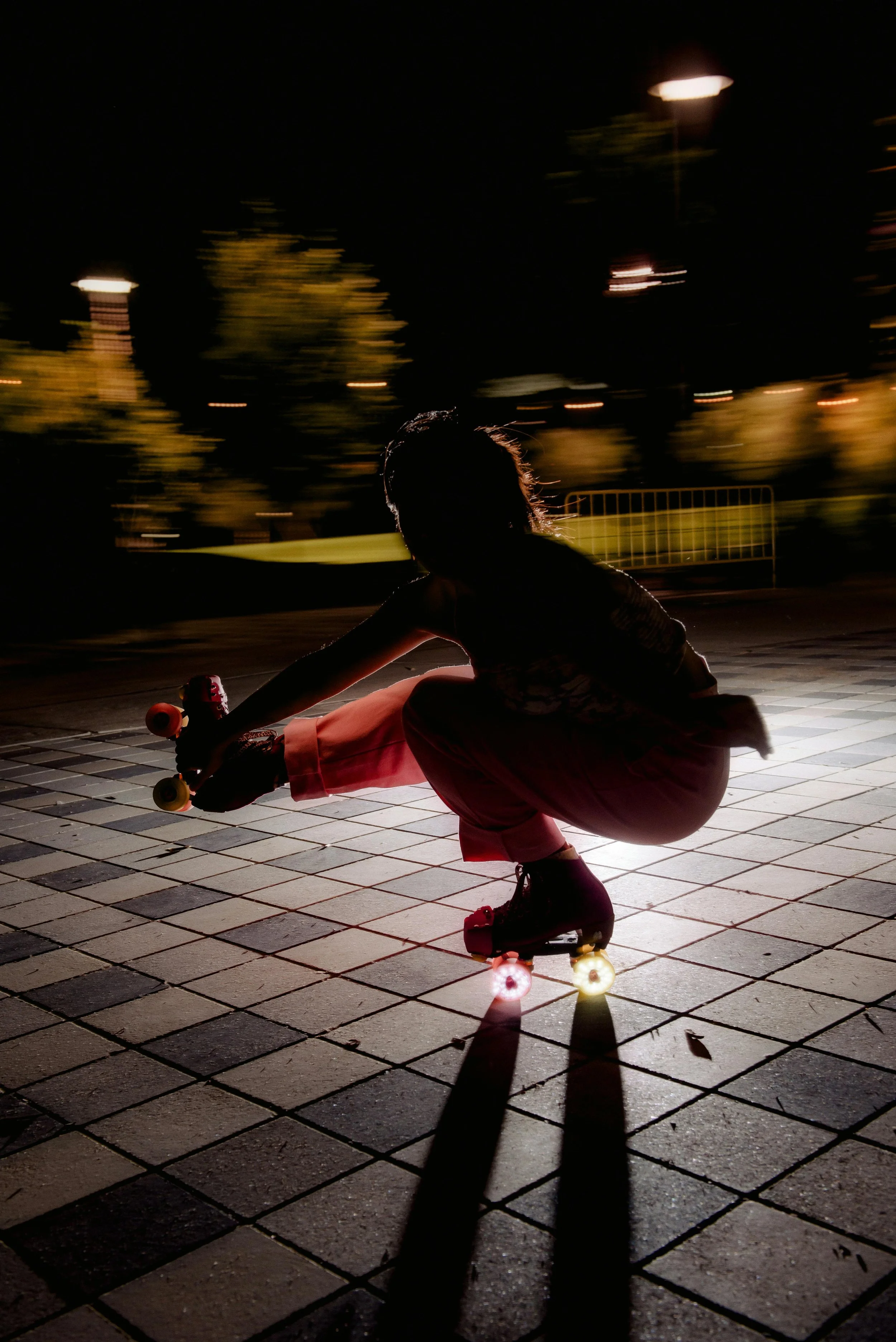
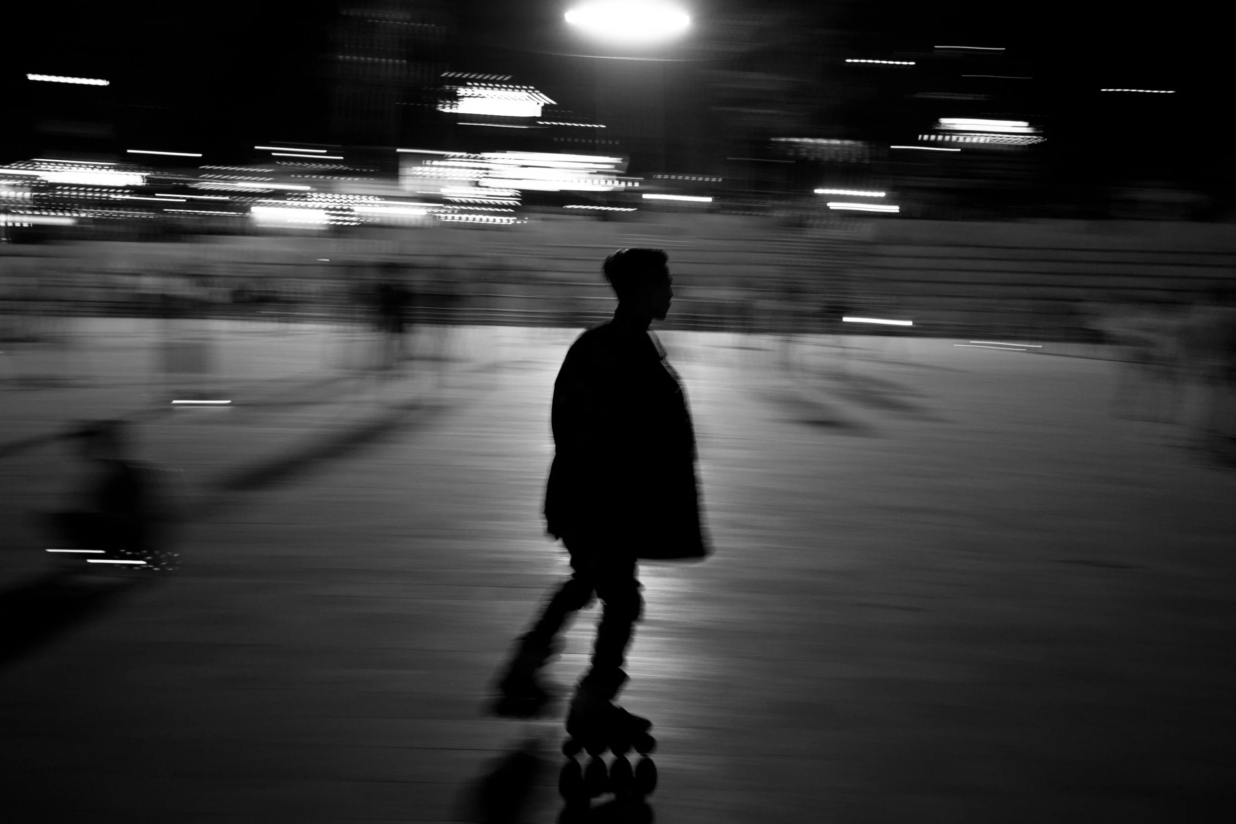
Rollcall
discover events, explore skate locations, and connect with community — anywhere.
ROLE
Sole UX/UI Designer
TIMELINE
5 weeks
TOOLS
figma, figjam, zoom, canva
THE PROBLEM
Roller skaters rely on scattered sources like social media or word of mouth to find events, skate spots, and classes. It’s difficult to keep track of skate opportunities, especially when visiting a new city or community.
THE SOLUTION
Rollcall is a centralized app for skaters that makes finding locations and joining events feel effortless. The app focuses on intuitive navigation, clear information architecture, and provides a seamless browsing experience.
OVERVIEW
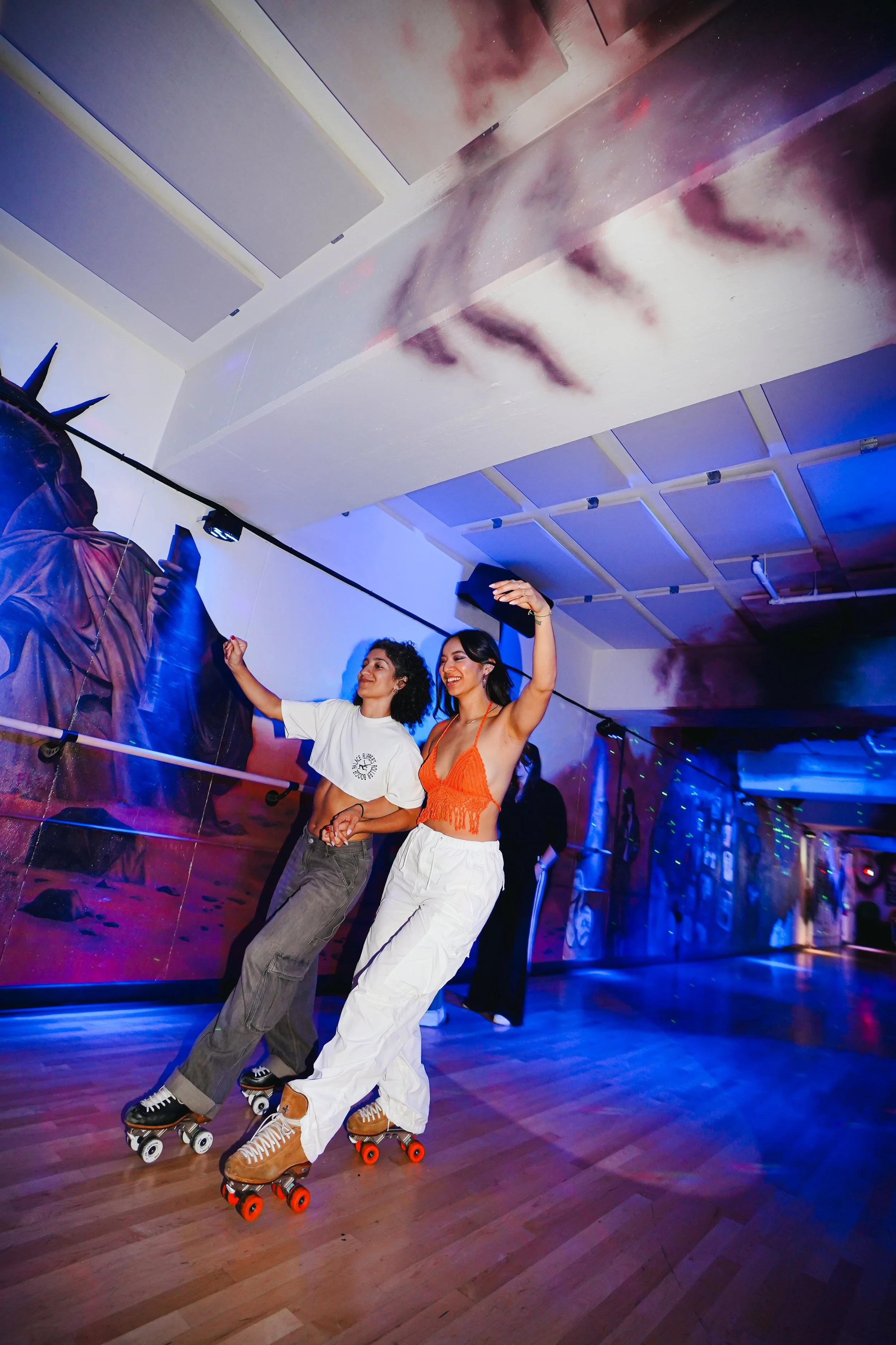
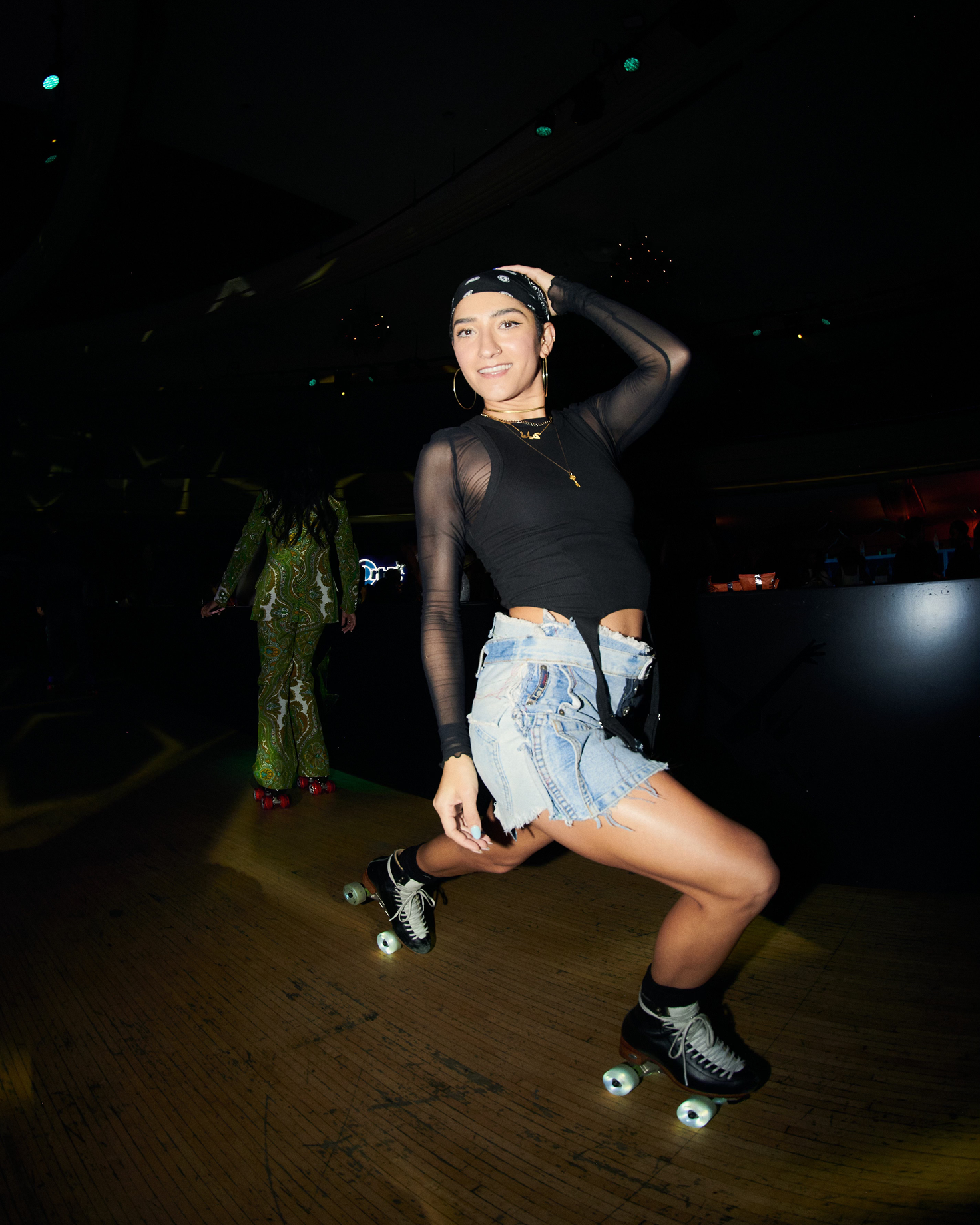
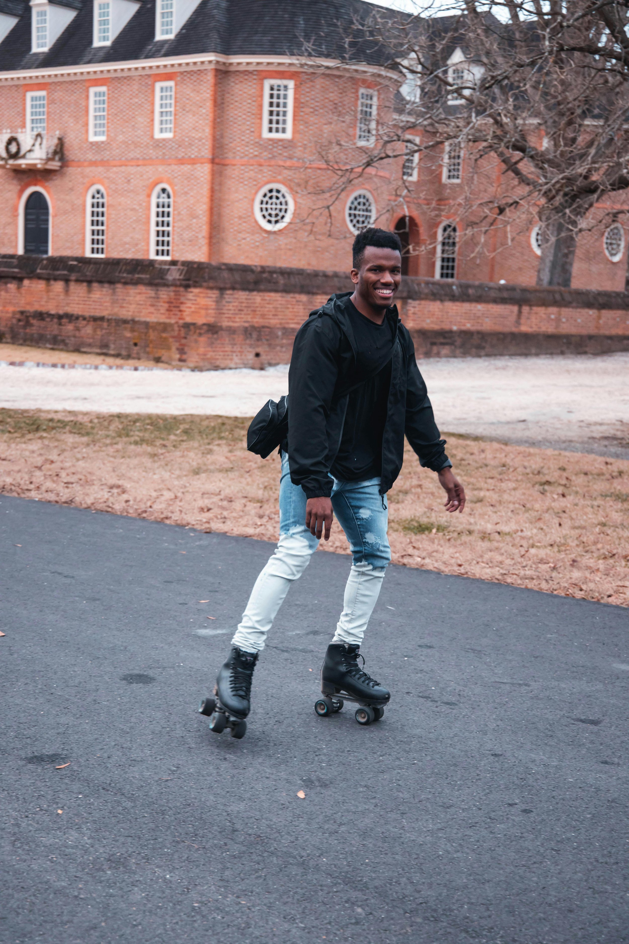
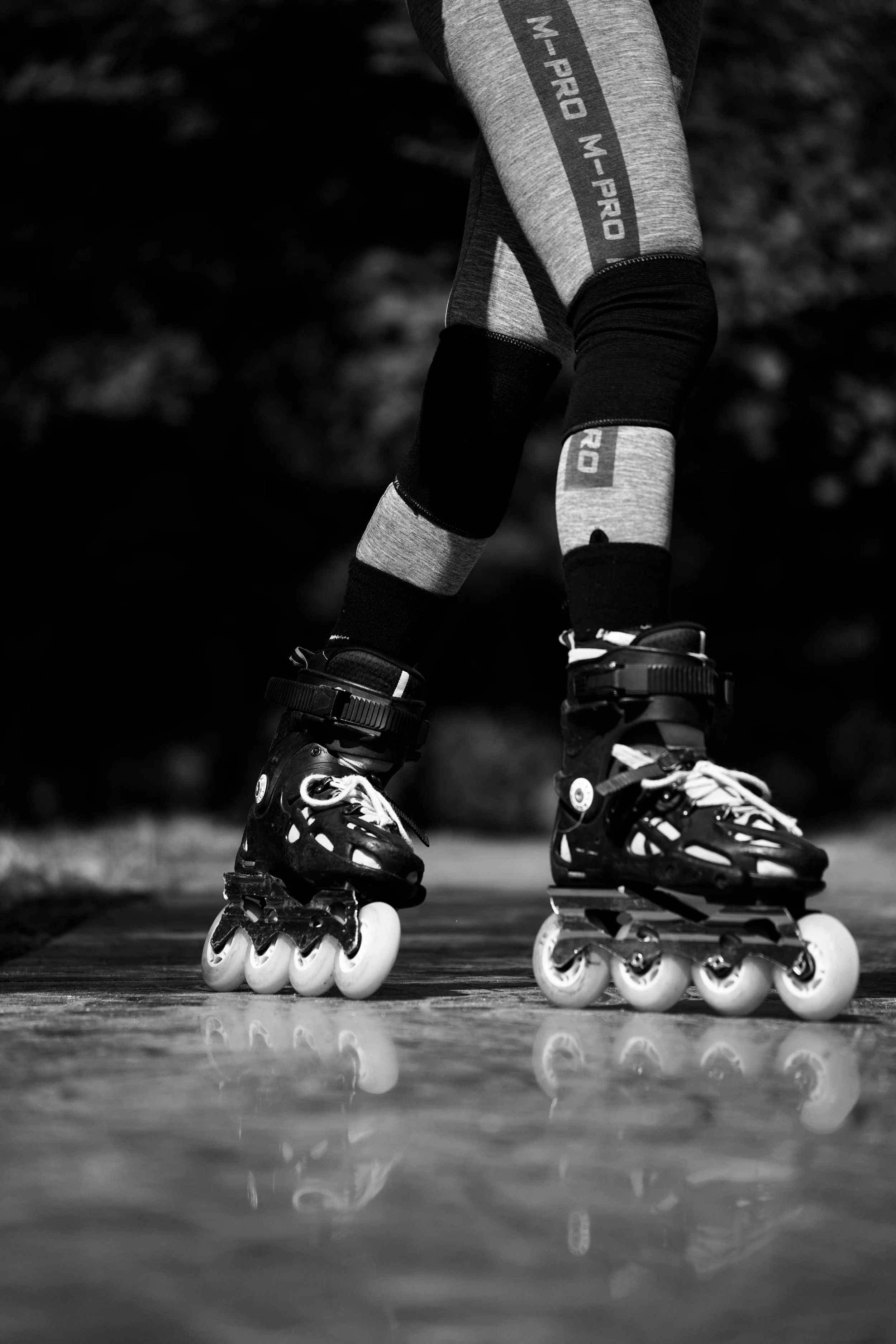
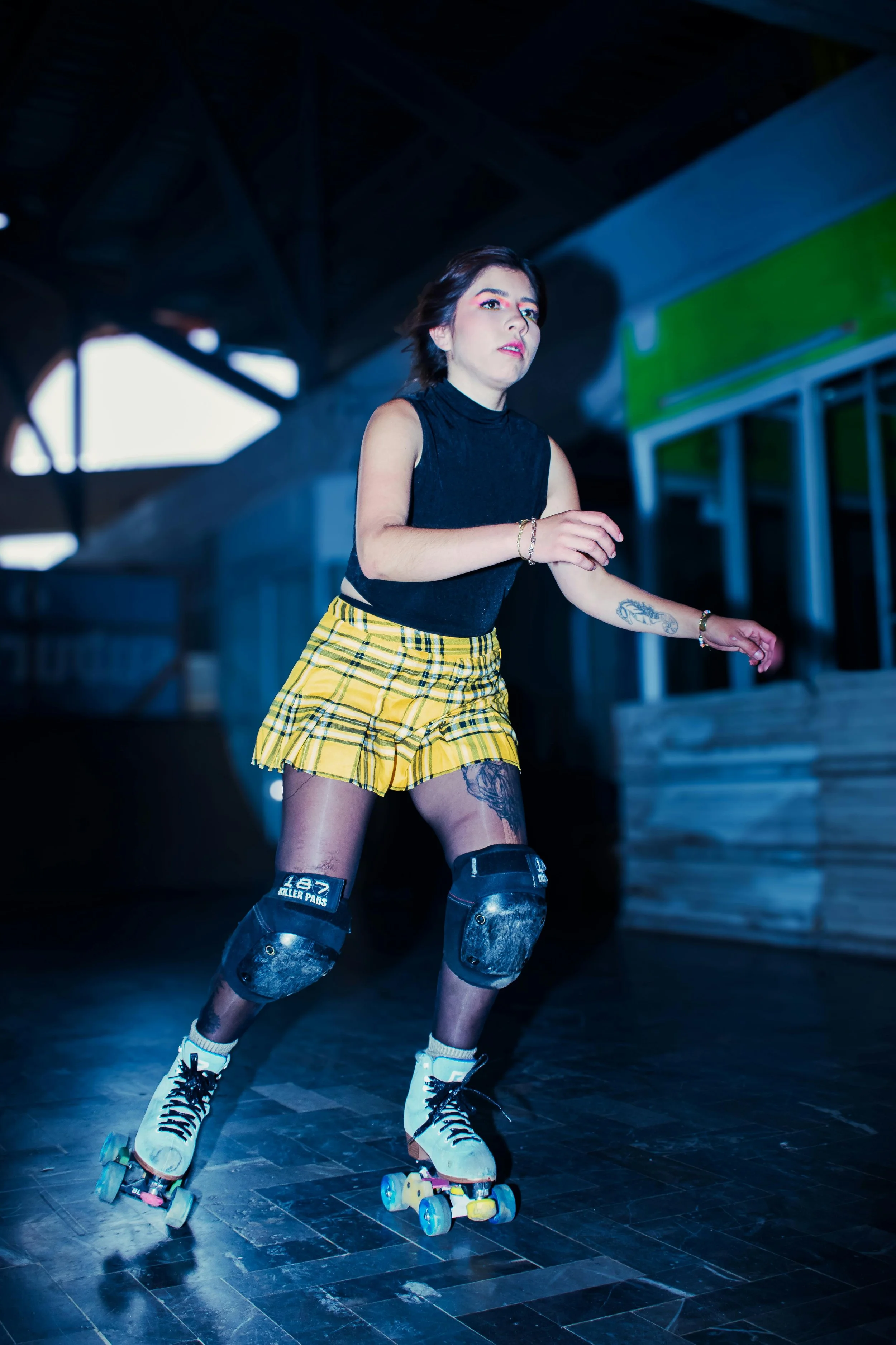
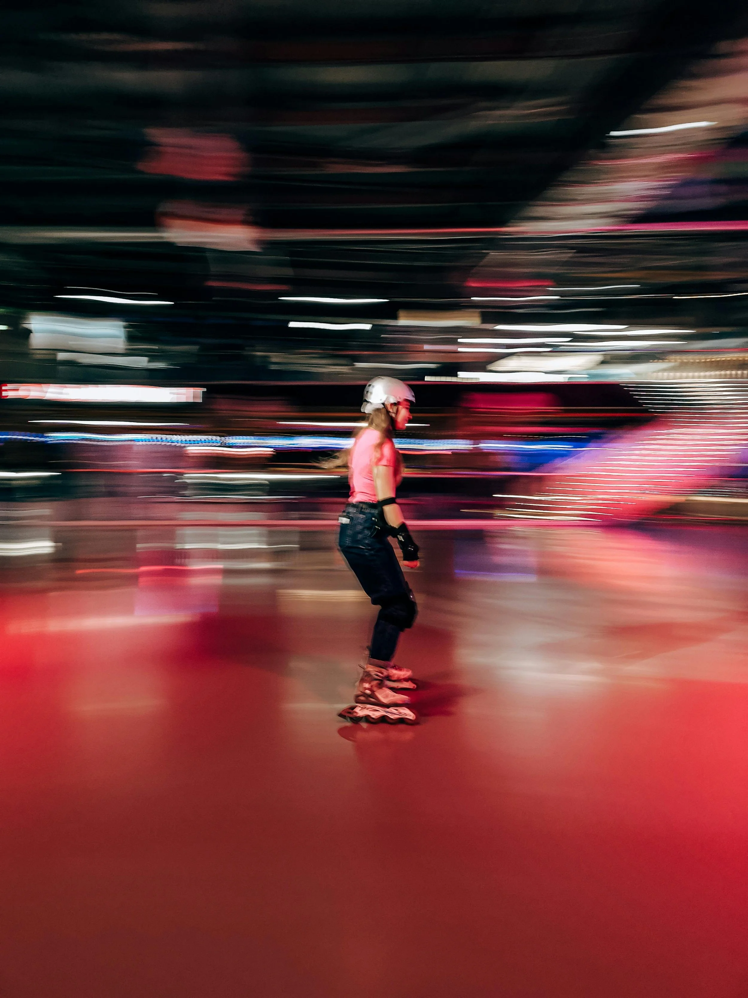
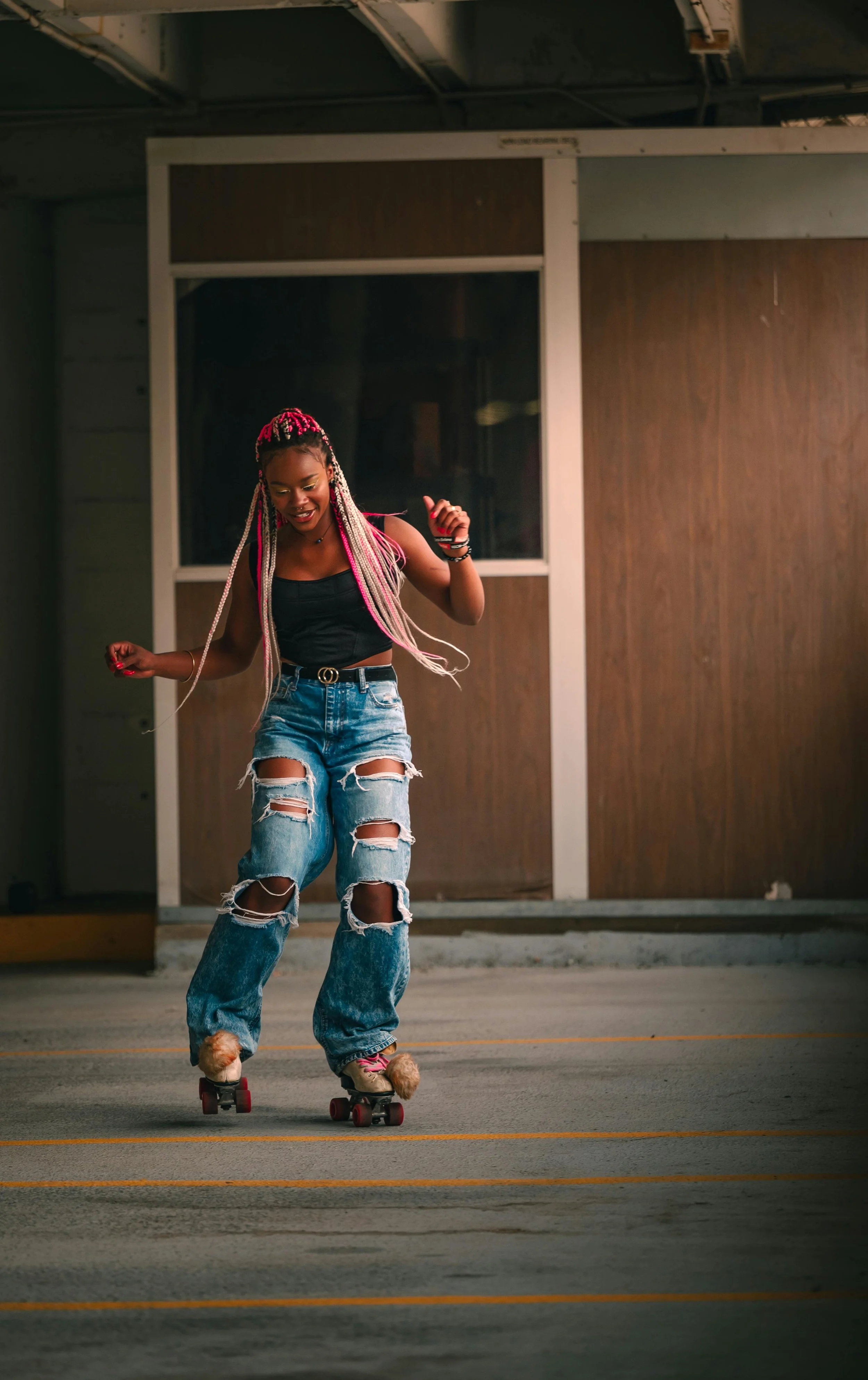
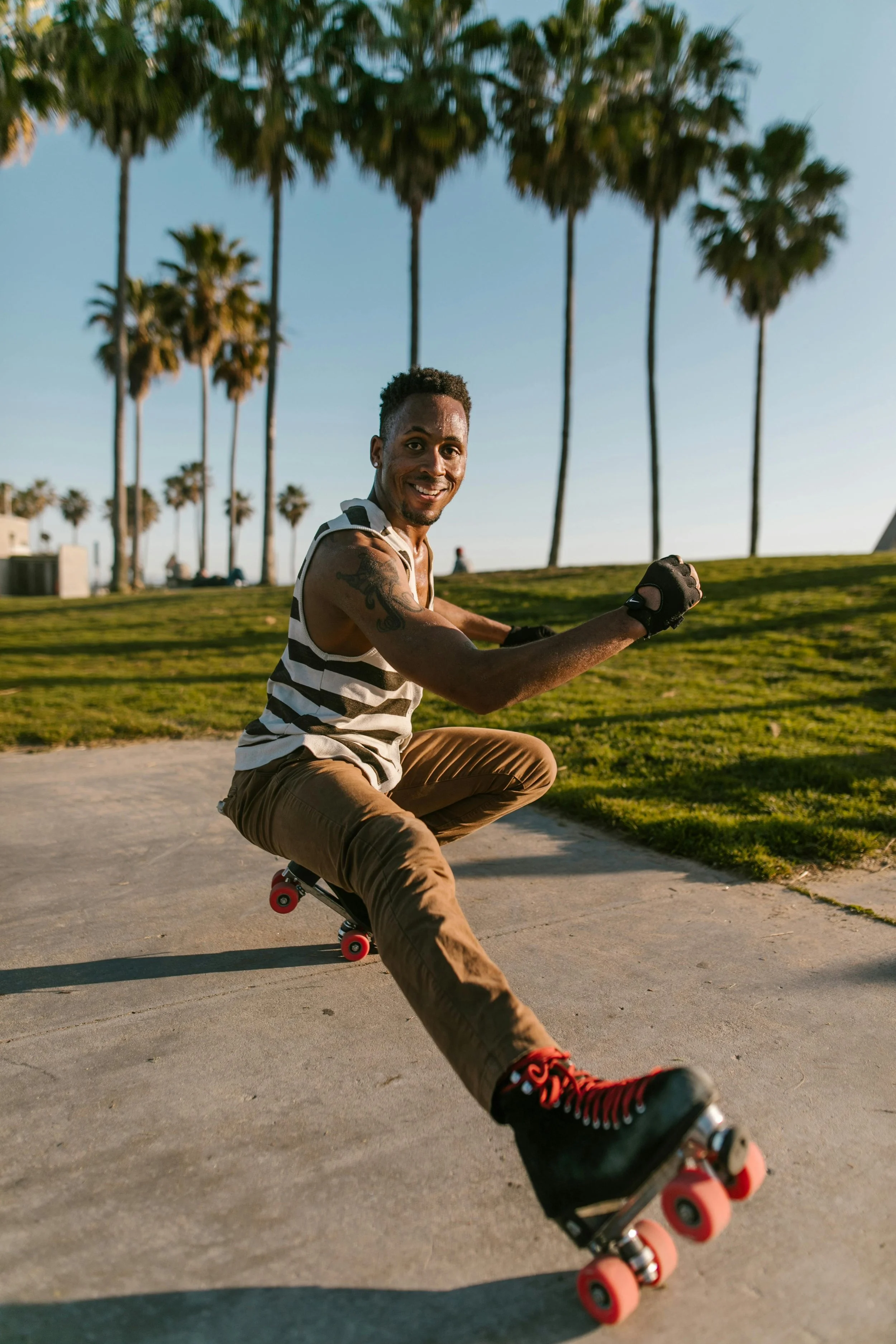
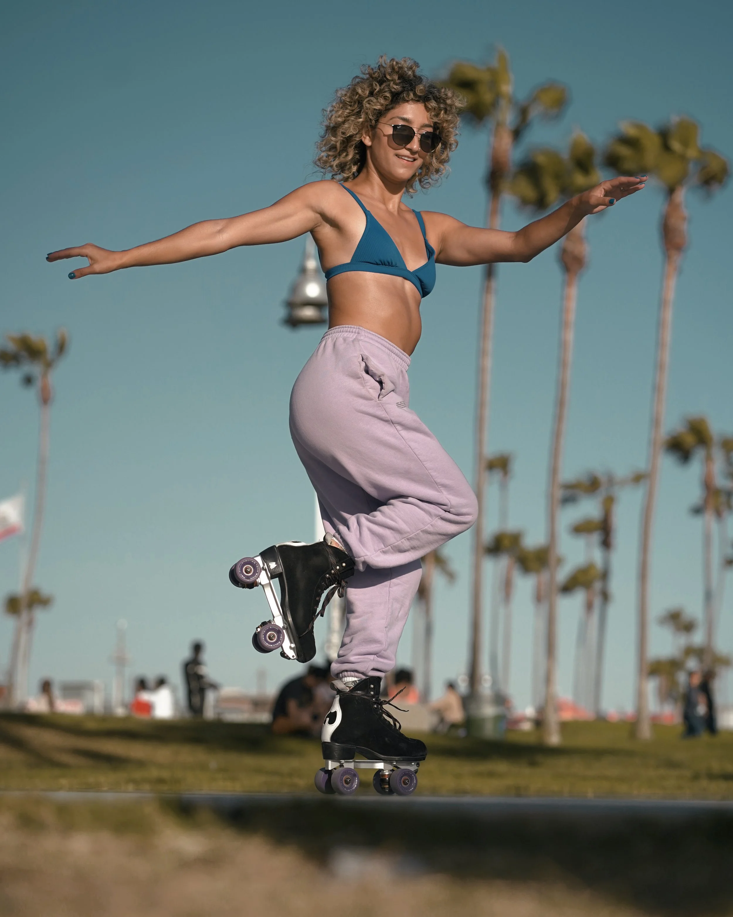
Roller skaters experience the world through a unique lens — seeing streets, parks, and open spaces as endless opportunities for movement and play. Skaters take on the laborious task of researching skate spots, often times jumping between multiple platforms. As a skater myself, I noticed how difficult it is to find reliable information. Rollcall was created to simplify discovery and make local skate communities more accessible.

research

GOALS
Understand how roller skaters currently find skating locations and events
Learn what features would be most useful in a mobile platform designed to support the skating community
COMPETITIVE ANALYSIS
I began my research by exploring diverse competitors — from a centralized skate app to a map based hiking trail finder. This helped reveal how each platform approached community, discovery, navigation, and event sharing differently.
STRENGTHS
Event discovery and location based browsing
Strong community building features
Visual content and user generated media create engagement and social proof
Reviews, saved places, and favorites help users plan and revisit experiences
WEAKNESSES
Platforms are not tailored to the roller skating community (except Let’s Roll)
Event discovery can feel cluttered or difficult to filter
Lack of specific information like skate surface type or skate friendly amenities
Users need to switch between multiple apps
OPPORTUNITIES
Provide more detailed location information like surface type, safety, parking, and music
Improve local discovery by notifications and location settings
Support users who are traveling and looking for skate communities in unfamiliar cities
Develop a visually immersive and inclusive experience that reflects the energy and identity of skate culture
Reduce the need for users to rely on multiple platforms to plan skating activities
USER INTERVIEWS
I interviewed 5 roller skaters from various countries, who travel to skate. I gained critical insight directly from members of the skate community on experiences and specific needs.
“I message people on Instagram and ask where to skate”KEY INSIGHTS
Discovery is fragmented
Instagram, word of mouth, and local chats make it easy to miss events
Traveling creates friction
Finding skating opportunities in new cities is difficult without insider knowledge
Community access is inconsistent
Users want to connect, but don’t always know where to start
Information is unreliable or incomplete
Choosing where to skate depends on more than just location — understanding environment, safety, surface quality are all influential factors
“I always forget about events and have to go search again”DESIGN OPPORTUNITIES
Centralize context heavy information for skate spots & events (e.g. surface, safety, vibes)
Opportunity to better support social connection and community building within the skating ecosystem
Cleaner UI — more modern, minimal, and intuitive
Improve discoverability of skate locations and events through better search and organization
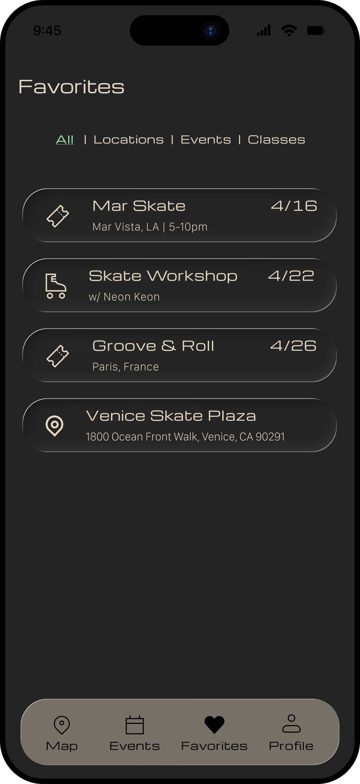
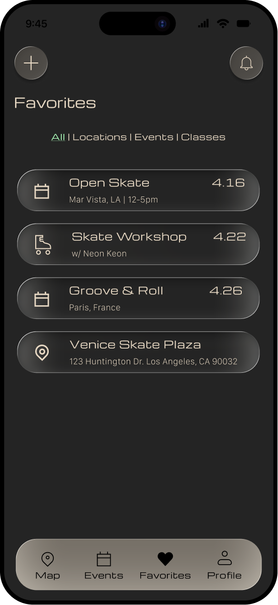
Create tools that help users save, organize, and revisit skating locations and events
define

USER PERSONA
After synthesizing data from the interviews, I had a clear path to my user persona — meet Tim!
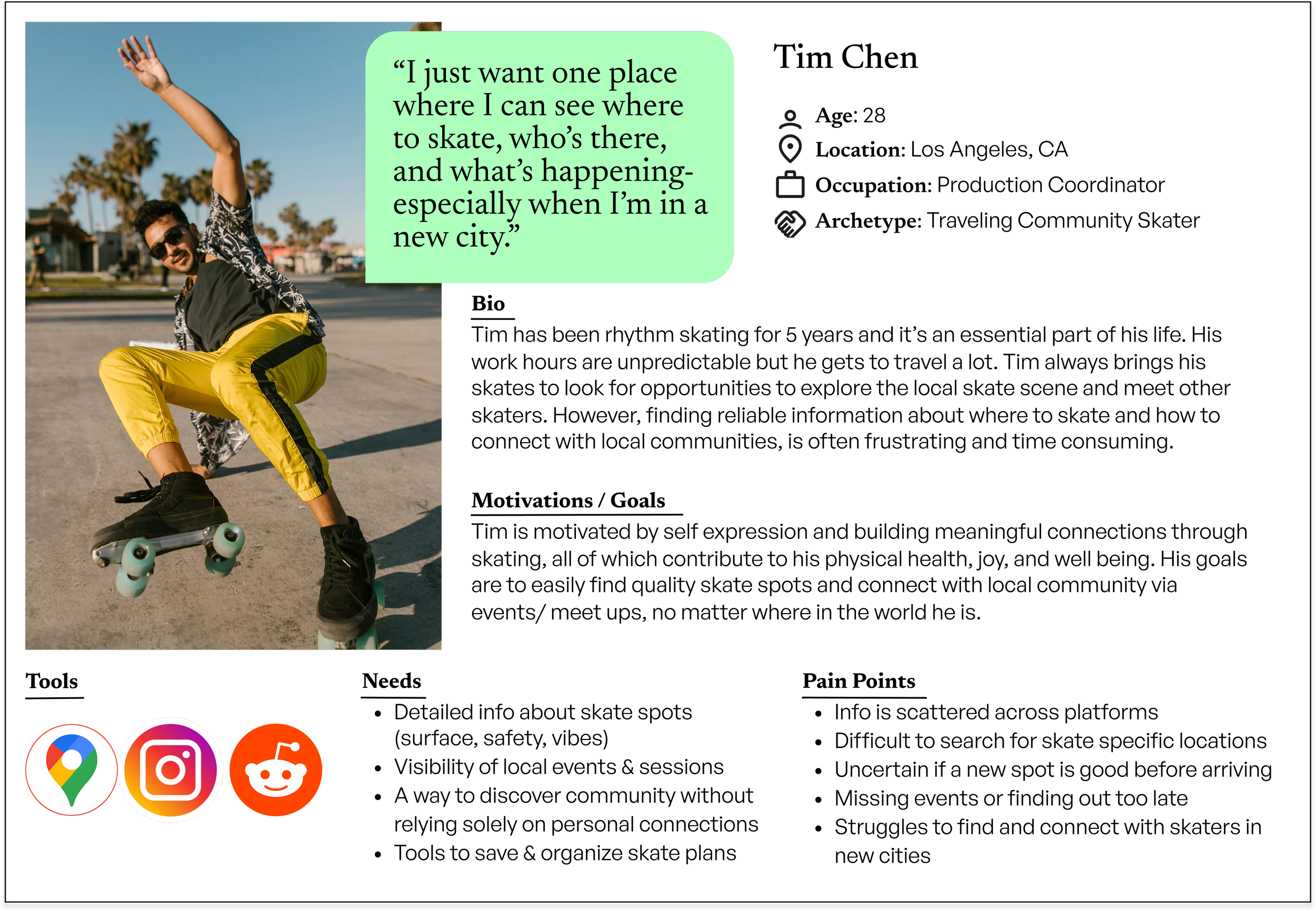
how might we help skaters easily discover locations & events at home or when visiting a new city?
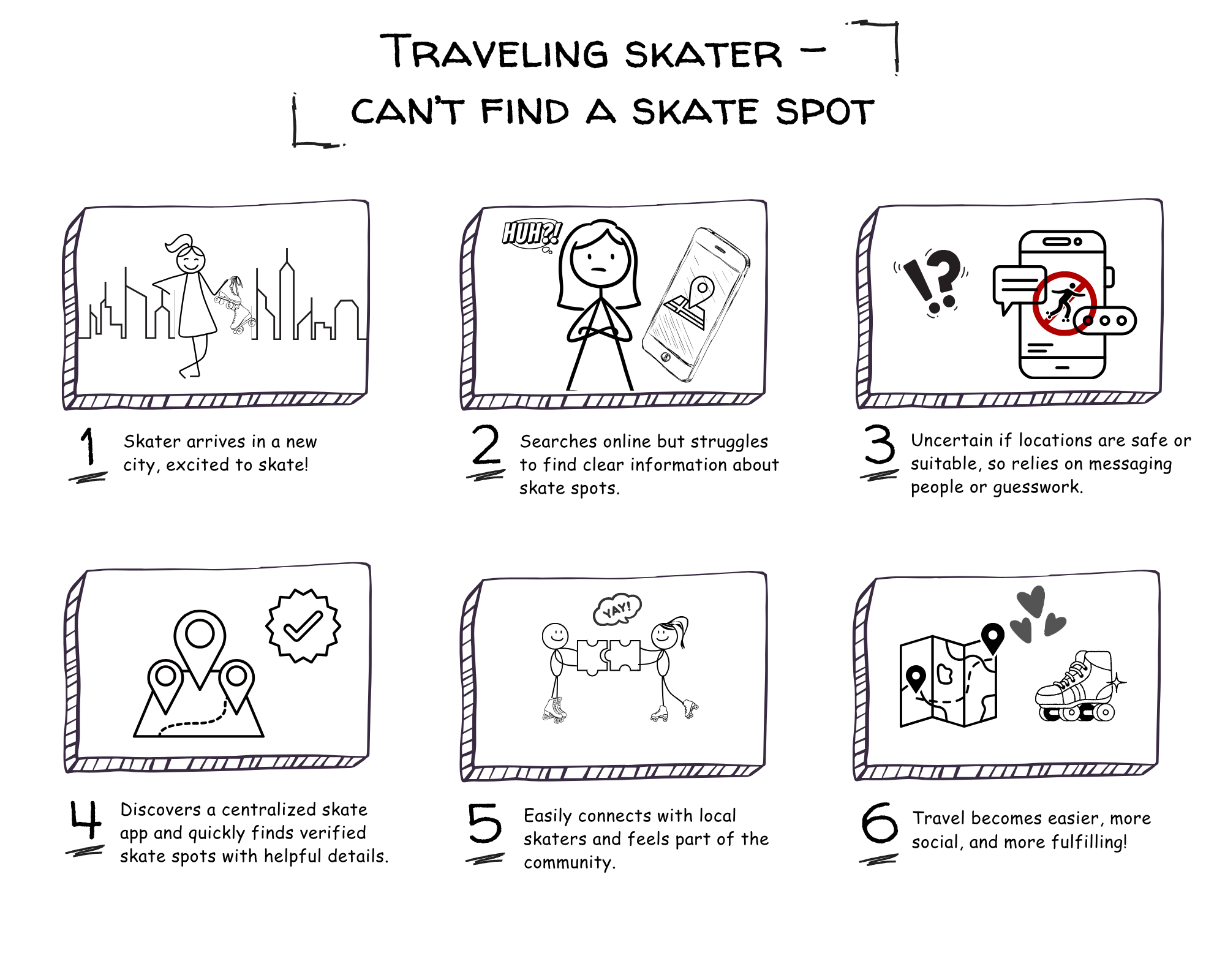
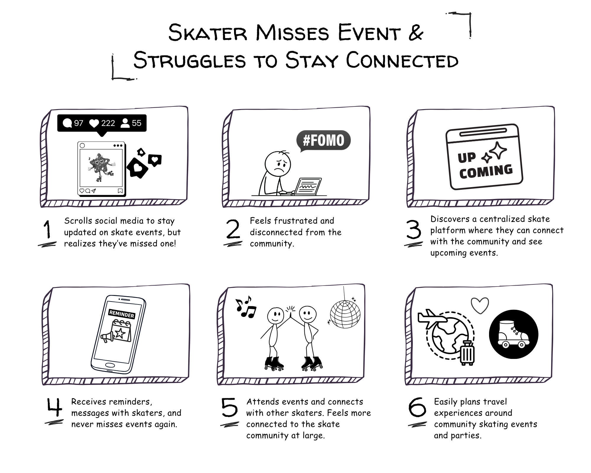
STORY BOARDS
I created story boards for more real life context — This helped highlight key moments of friction and informed the direction of the design by emphasizing the need for a more seamless and centralized discovery experience.
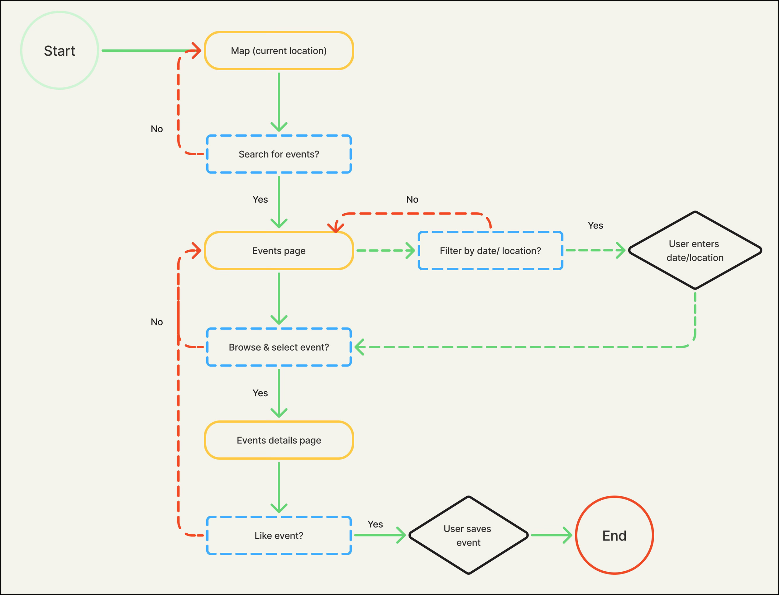
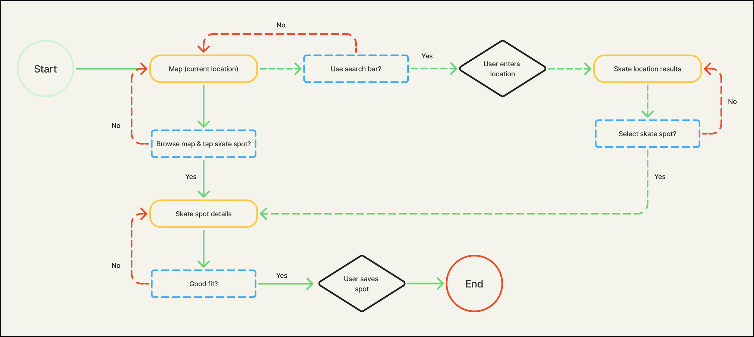
USER FLOWS
Users struggle to find reliable skate locations and events, especially when traveling or exploring new communities — discovery is fragmented.
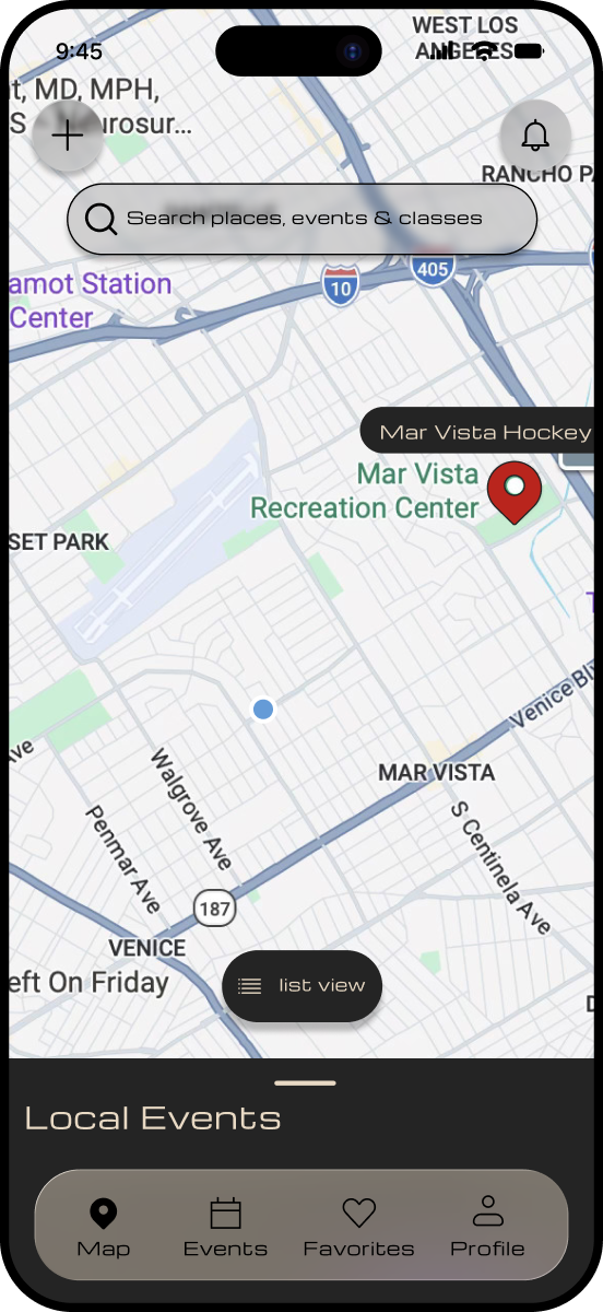
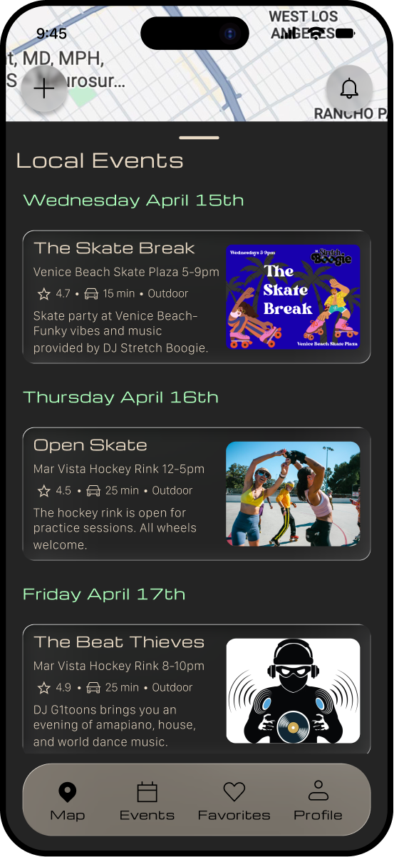
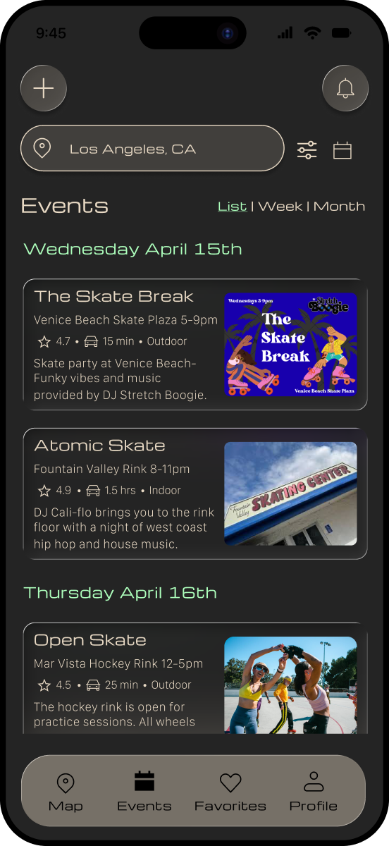
To address this, I designed two core discovery flows: a map based experience for exploring skate locations and a calendar based system for browsing events. These flows provide users with flexible entry points depending on their needs.
design

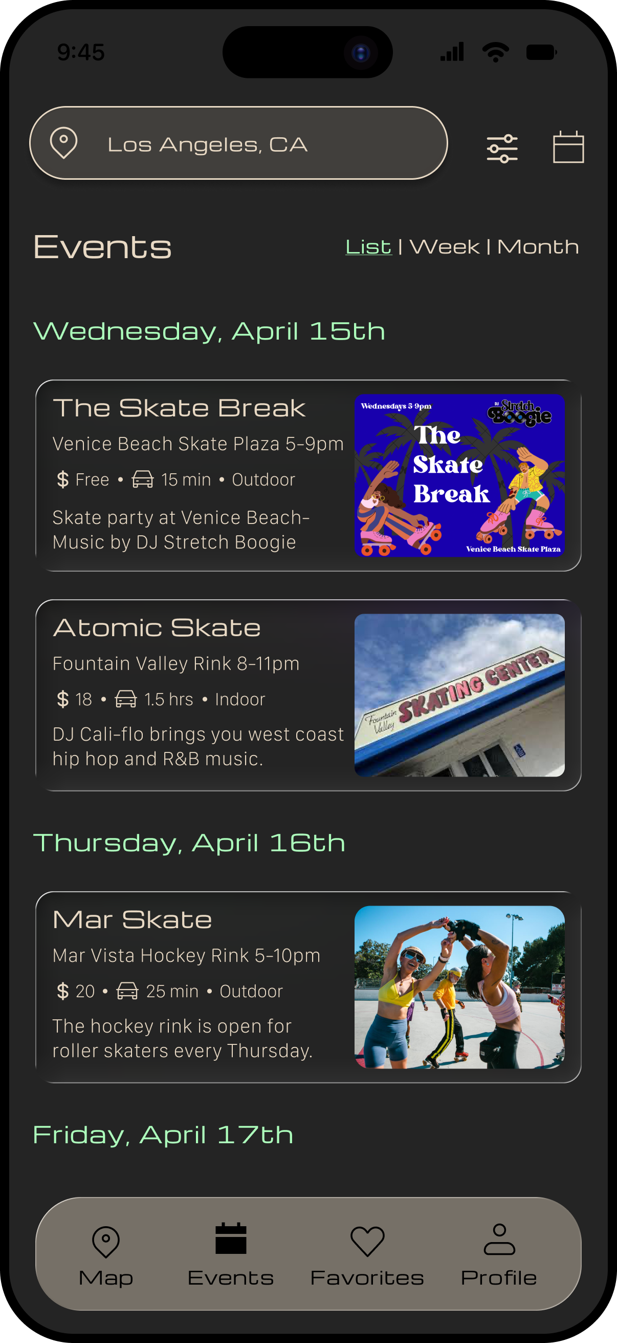
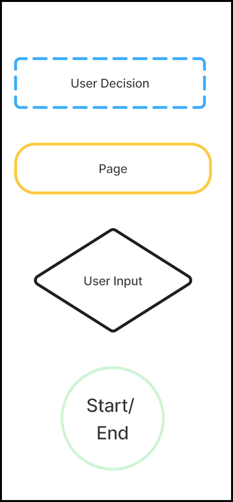
LOW FIDELITY WIREFRAMES
My low fidelity wireframe concepts focused on the map for location discovery and event browsing through a calendar or list view. I also explored supporting features like saved items and personalized recommendations via user enabled location settings.
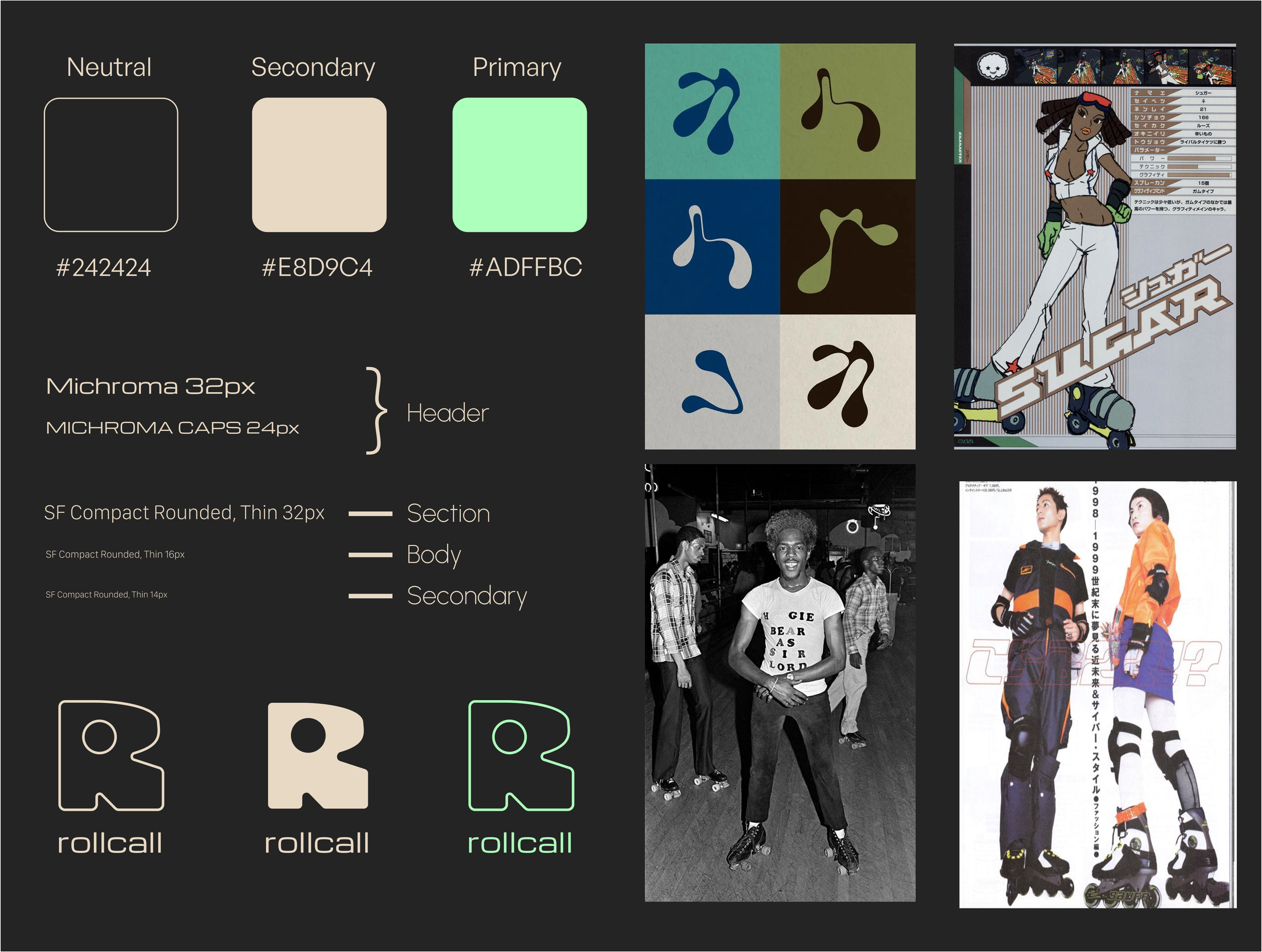
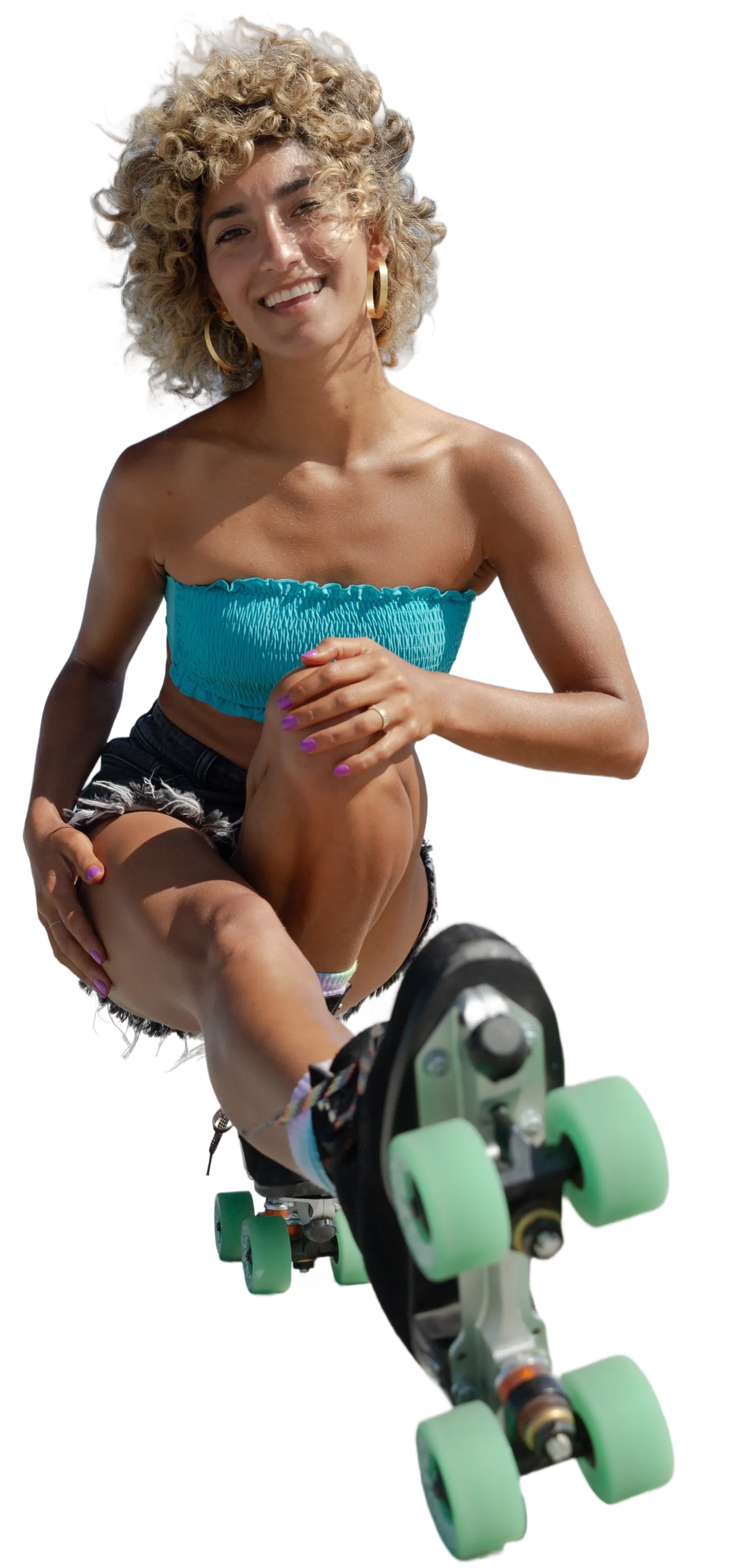
BRANDING
For the visual direction, I intentionally steered away from the stereotypical representations of roller skating depicted in popular media, such as 70s disco or 80s Venice Beach aesthetics. Instead, I wanted to reflect the broader and more diverse culture of skating spanning different communities and histories.
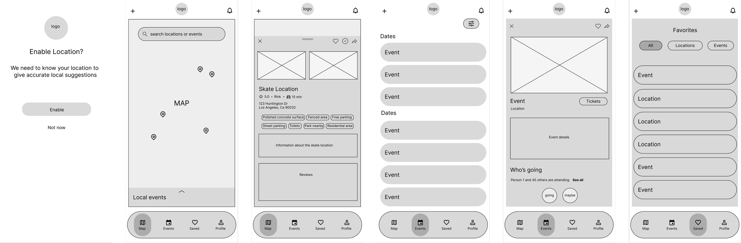
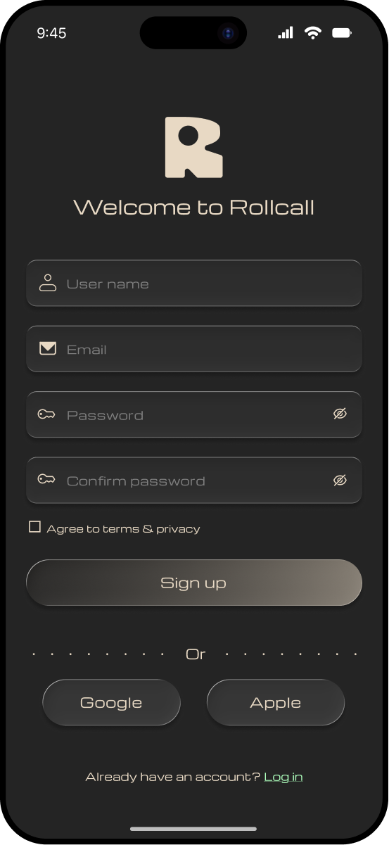
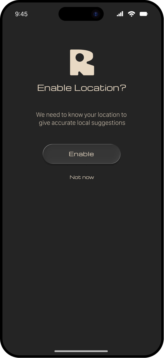
HIGH FIDELITY WIREFRAMES
I created the first round of high fidelity wireframes — the focus was on navigation, establishing clear information hierarchy, and designing core discovery features for locations and events. These designs prioritized intuitive flows and quick access to key information.
testing
To evaluate the effectiveness of the high fidelity designs, I conducted usability testing with 5 roller skaters: 4 who have traveled to skate and 1 who was interested in doing so.
“I’d love to have a sample of the music to know the event vibe”KEY INSIGHTS
5/5 users successfully completed both flows without major breakdowns
3/5 users needed heart icon clarity
4/5 users requested more social, contextual, and chat features on event info pages
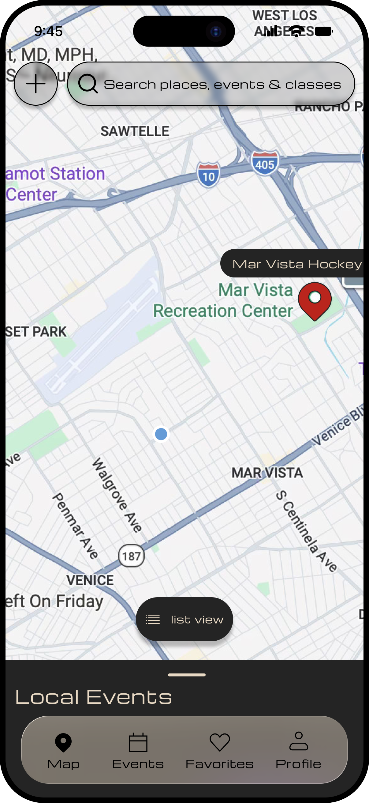
THE MAP WAS A USER FAVORITE
"I didn't notice the heart button at first"ITERATIONS
The iterations below demonstrate how I addressed key usability issues identified during testing — I focused on improving clarity of buttons, information hierarchy, and discoverability.
BEFORE
AFTER
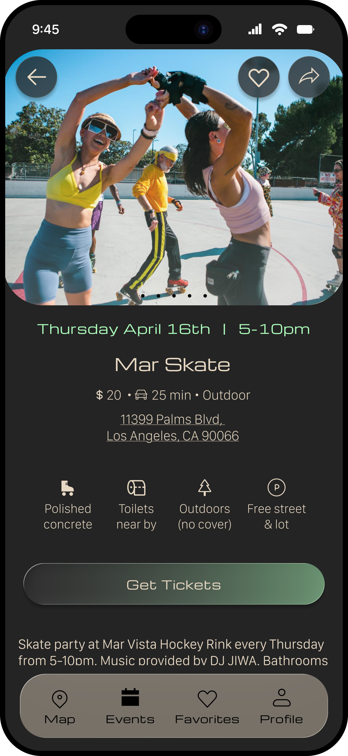
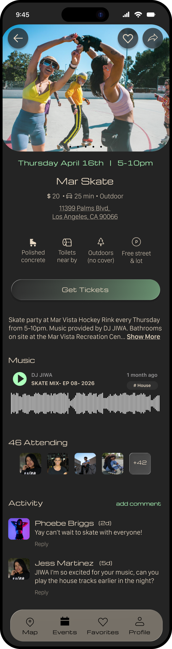
UPDATE
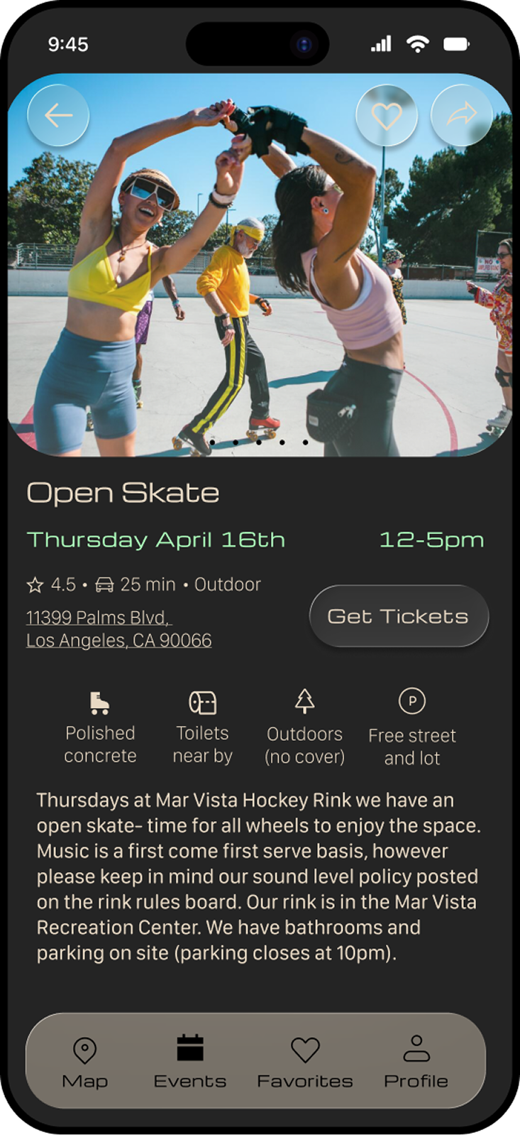
I emphasized the “Get Tickets” CTA, added an attendee view for social validation, and introduced a comments and a music preview section to enrich the event experience and social proof.
ISSUE
The event page lacked a clear primary action and did not provide enough context for users to feel confident attending the event.
OUTCOME
The page became more action oriented, informative, and engaging. This will help users make quicker and more confident decisions.
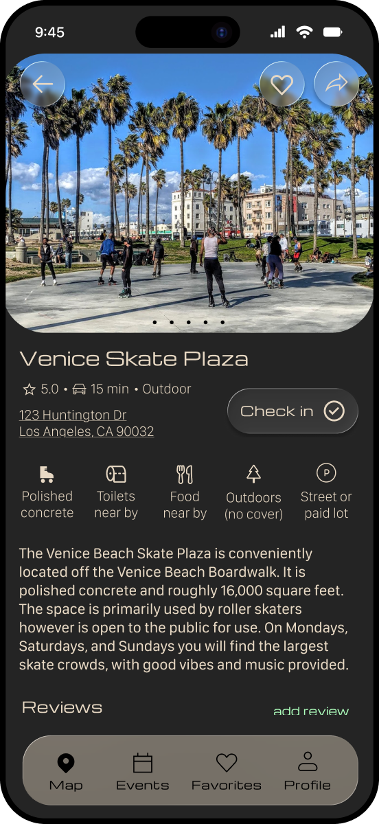
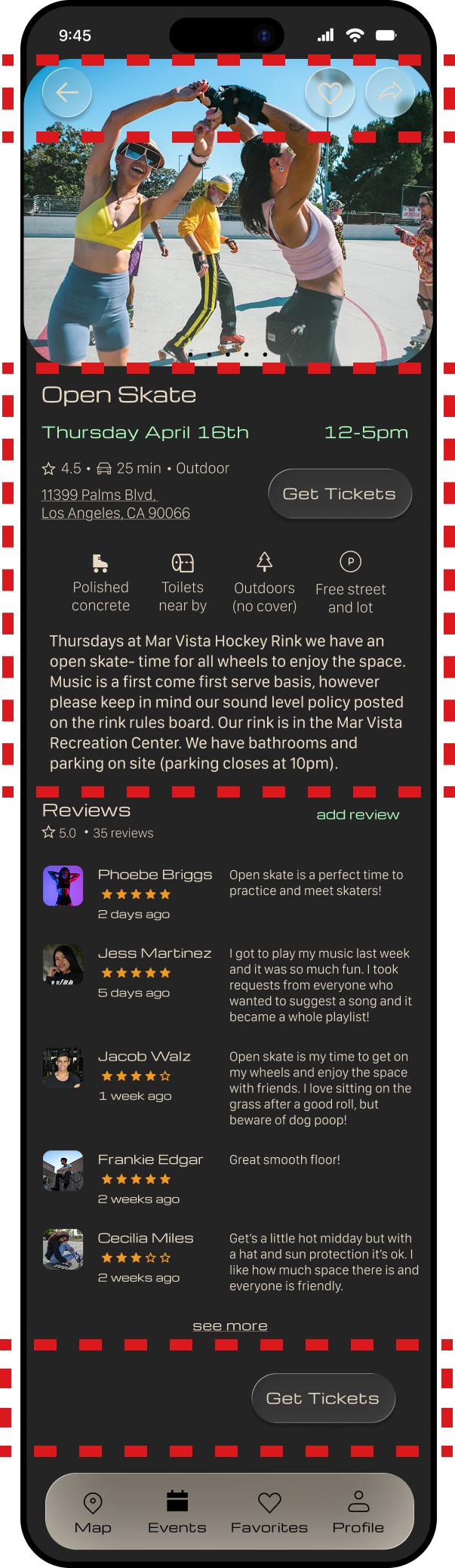
BEFORE
AFTER
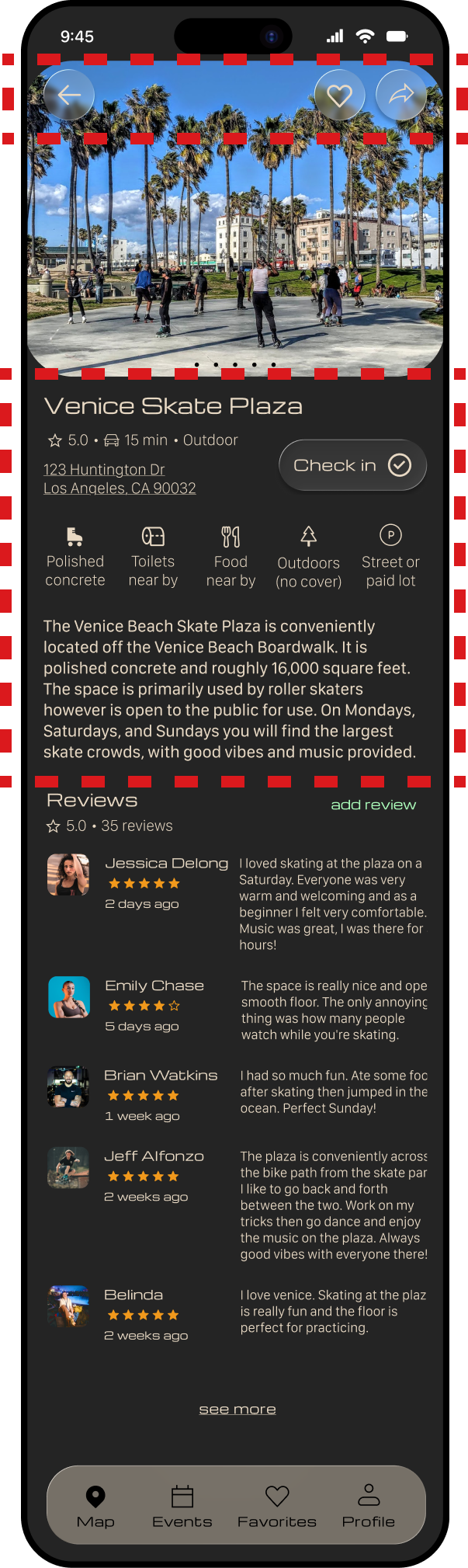
ISSUE
Users experienced visual confusion on the location page, with unclear icon hierarchy and competing elements that made it harder to quickly understand key information.
UPDATE
I improved icon visibility by adjusting color contrast, simplified the layout by centering the title and reducing the initial information density, and removed the “check in” feature to eliminate unnecessary complexity.
OUTCOME
These changes improve visual clarity, reduce cognitive load, and will help users more easily focus on primary actions like saving locations and engaging with reviews.
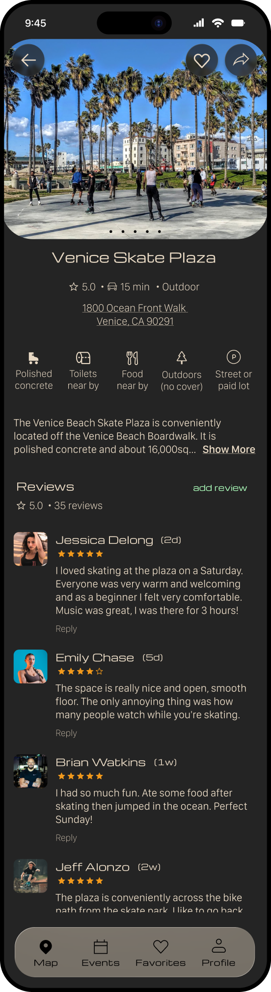
the final design
takeaways

WHAT DID I LEARN?
This project reinforced the importance of grounding design decisions in research and continuously validating ideas through testing. My early assumptions around navigation and feature clarity were challenged during usability testing, which led to more thoughtful and effective design solutions.
WHAT WOULD I IMPROVE?
I would continue exploring features that strengthen community interactions, like enhanced social connections or personalized recommendations. I would also conduct additional rounds of testing to refine edge cases and improve overall usability.
PERSONAL REFLECTION
This project highlighted how my background in movement and performance informs my approach to interaction design — thinking through flows, transitions, and how users move through an experience over time.