
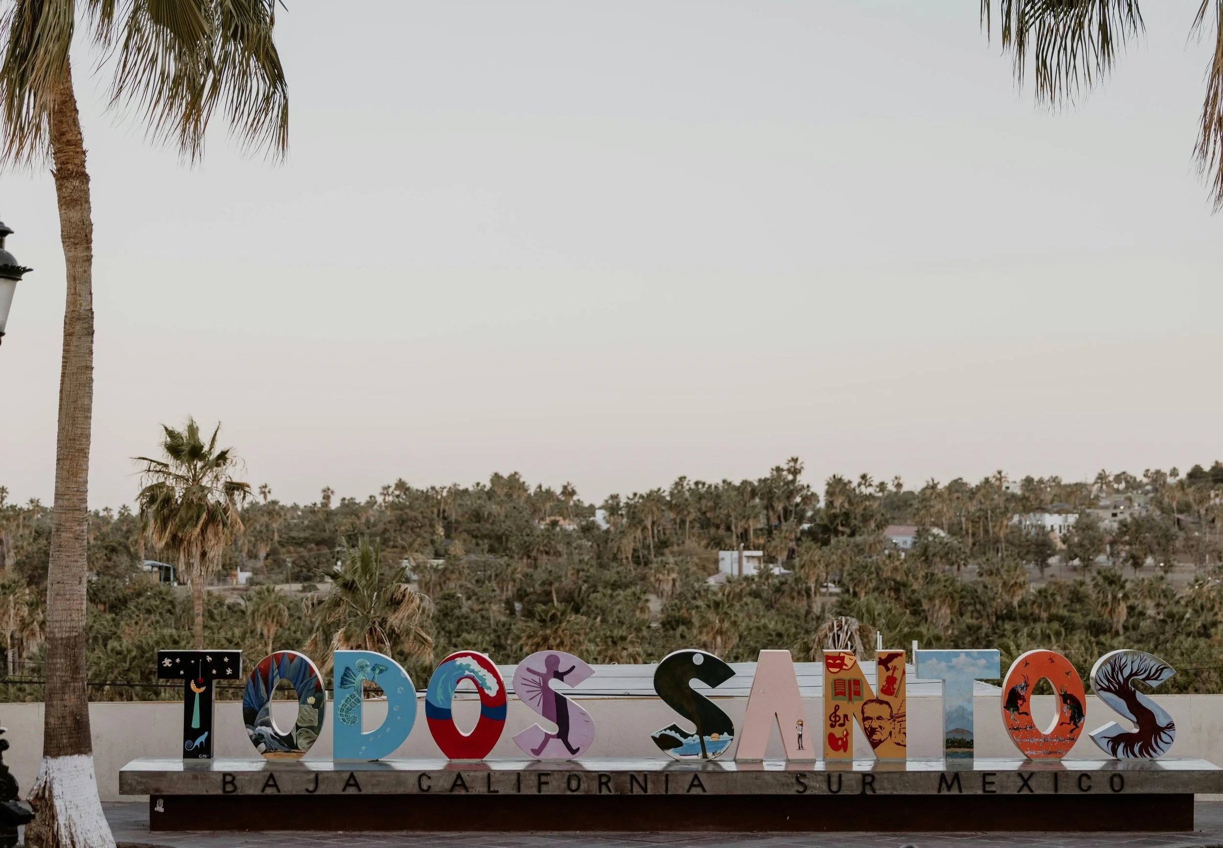
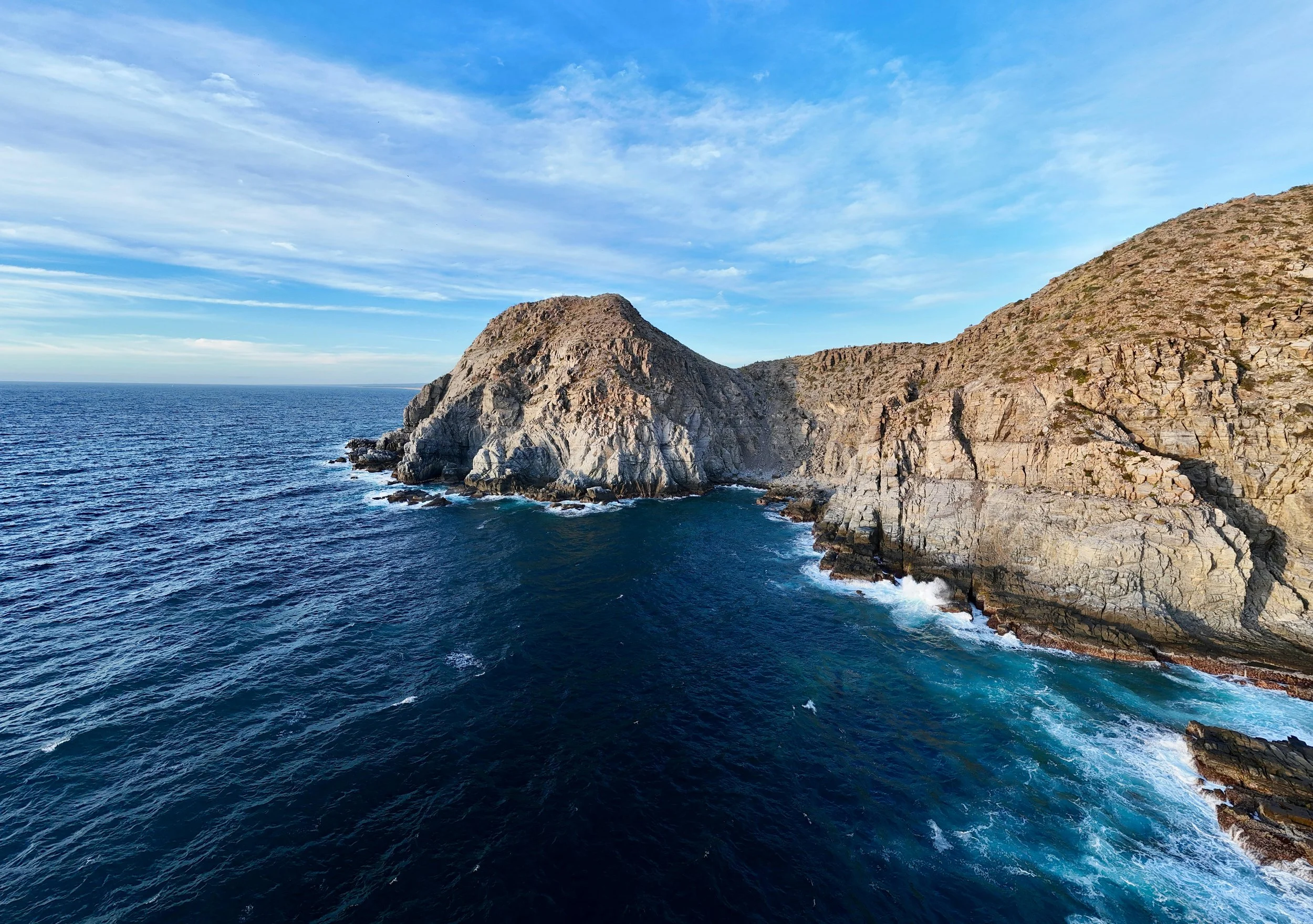
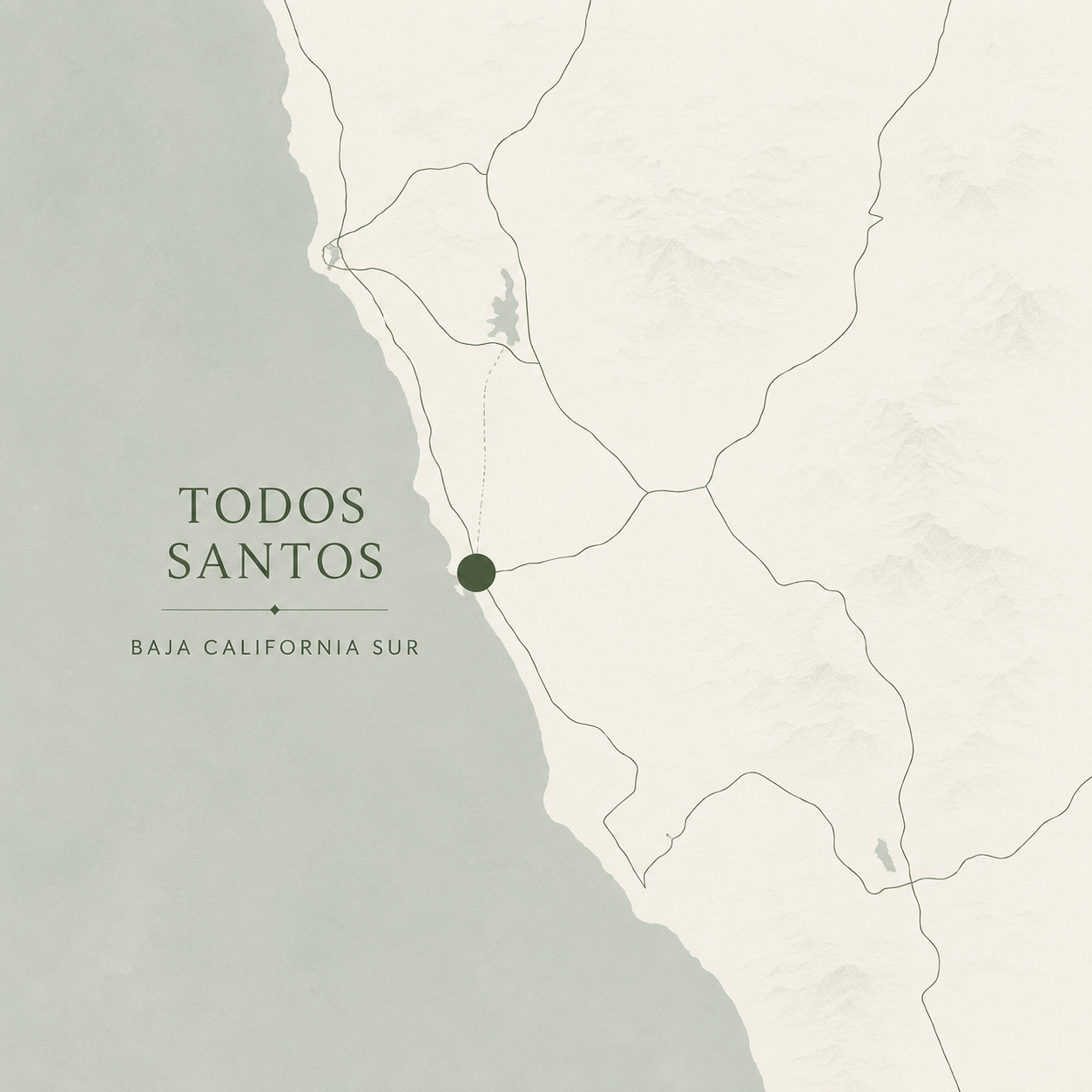
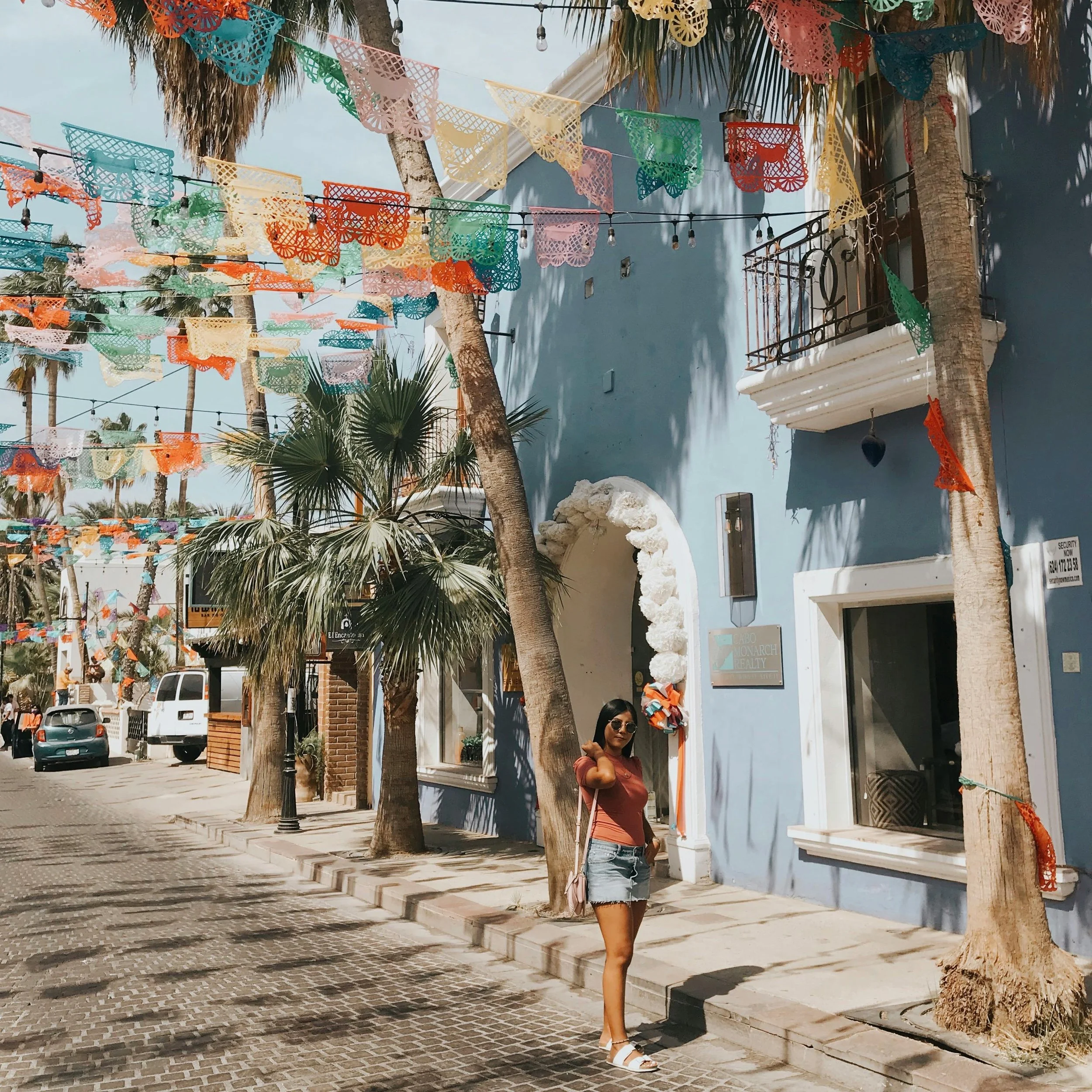
Casa Cochimí
Luxury boutique stays in Todos Santos, Mexico
ROLE
Sole UX/UI Designer
TIMELINE
7 weeks
TOOLS
figma, figjam, zoom
THE PROBLEM
Casa Cochimí relied entirely on third party platforms like Airbnb and VRBO for reservations, limiting the brand’s ability to create direct relationships with guests and maintain control over the booking experience. Travelers lacked a centralized platform to have more personalized and economical experiences.
THE SOLUTION
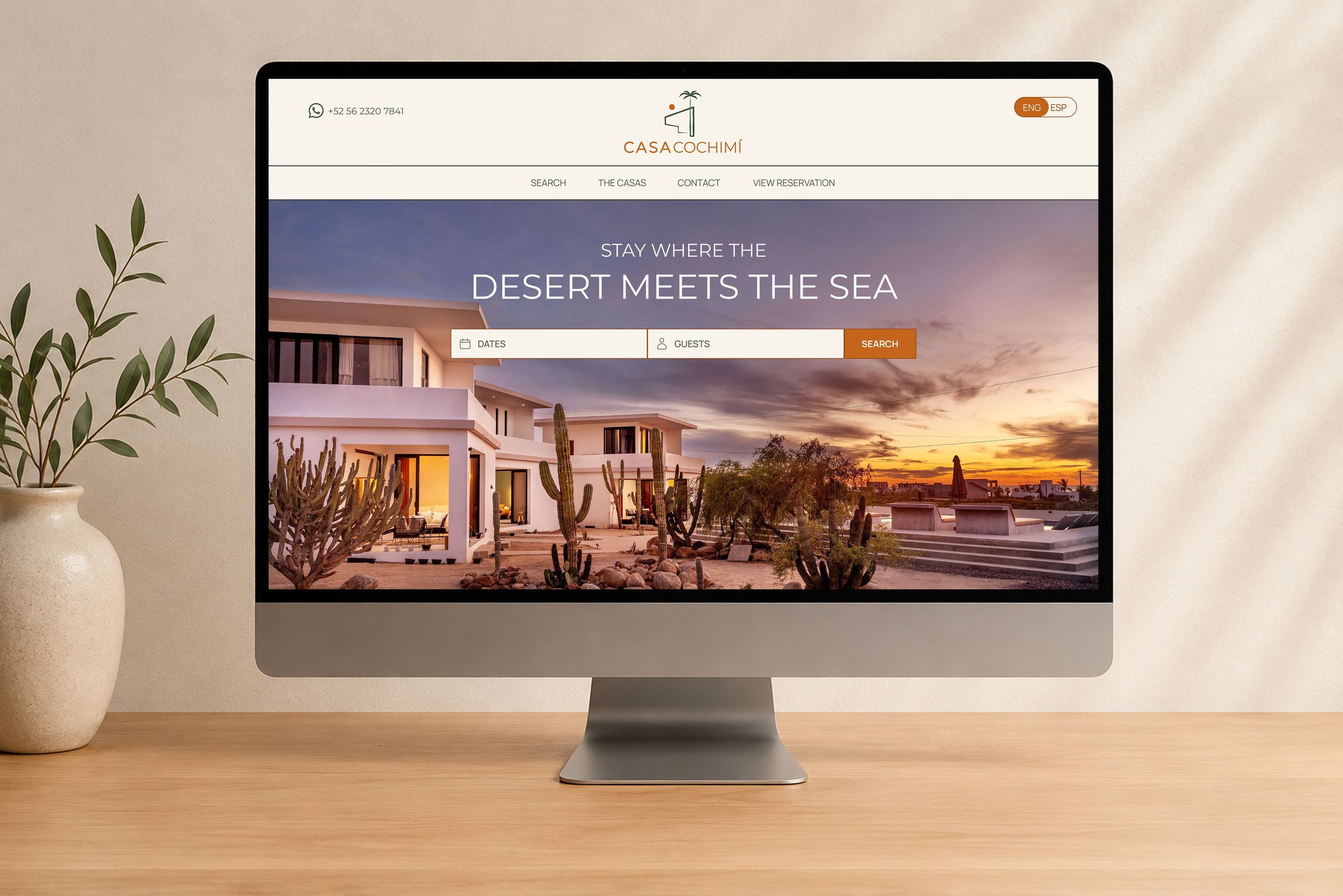
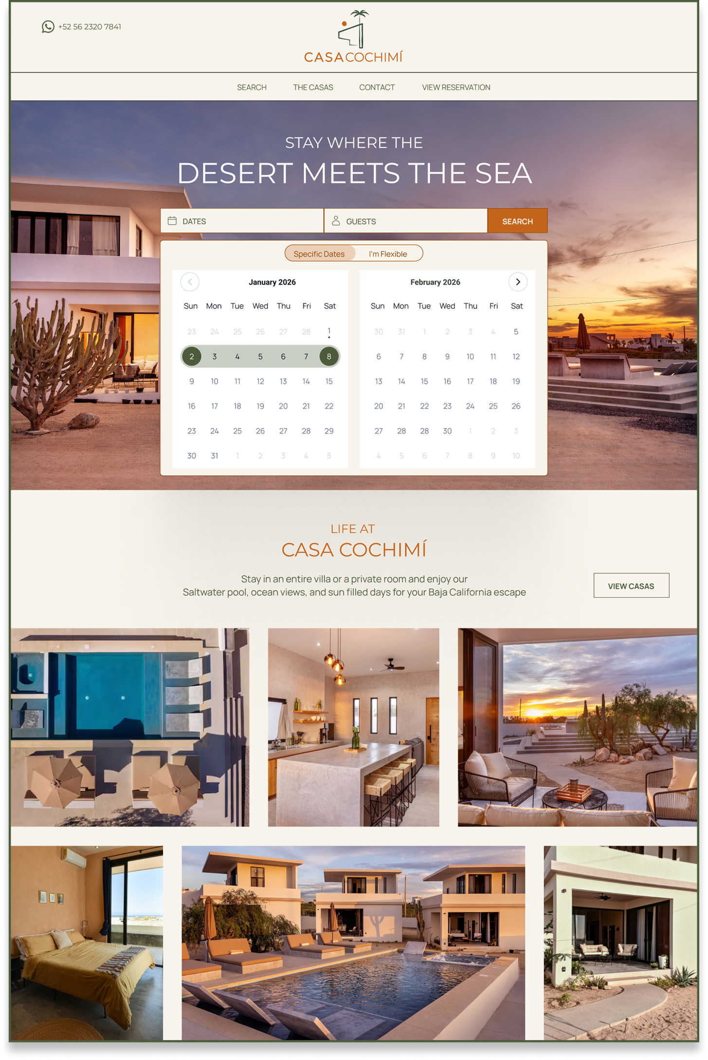
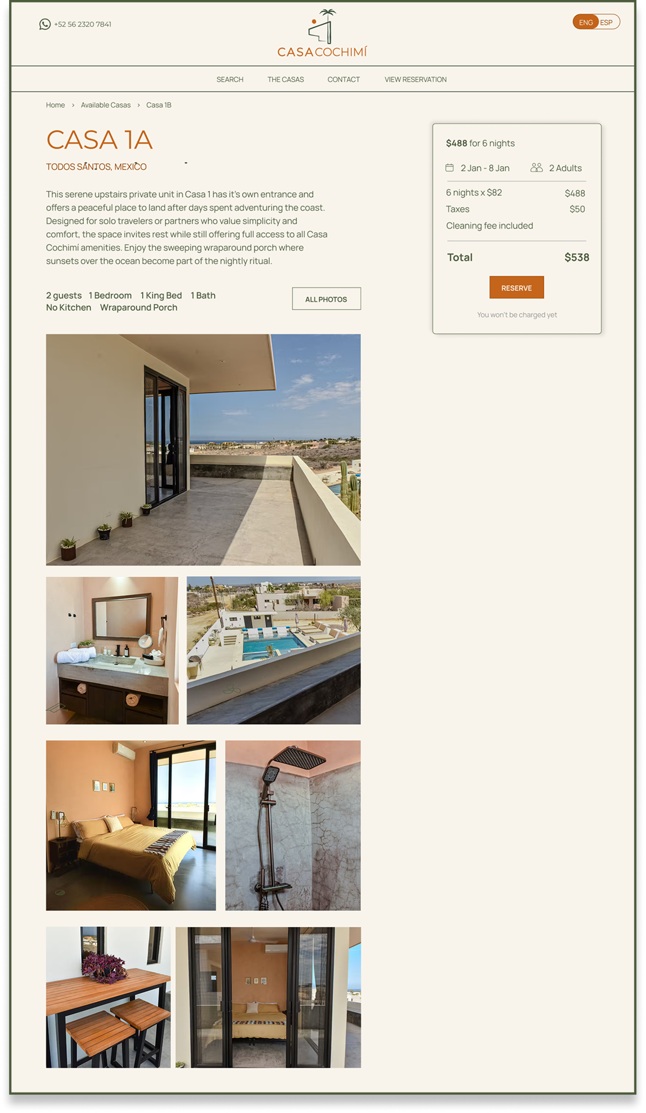
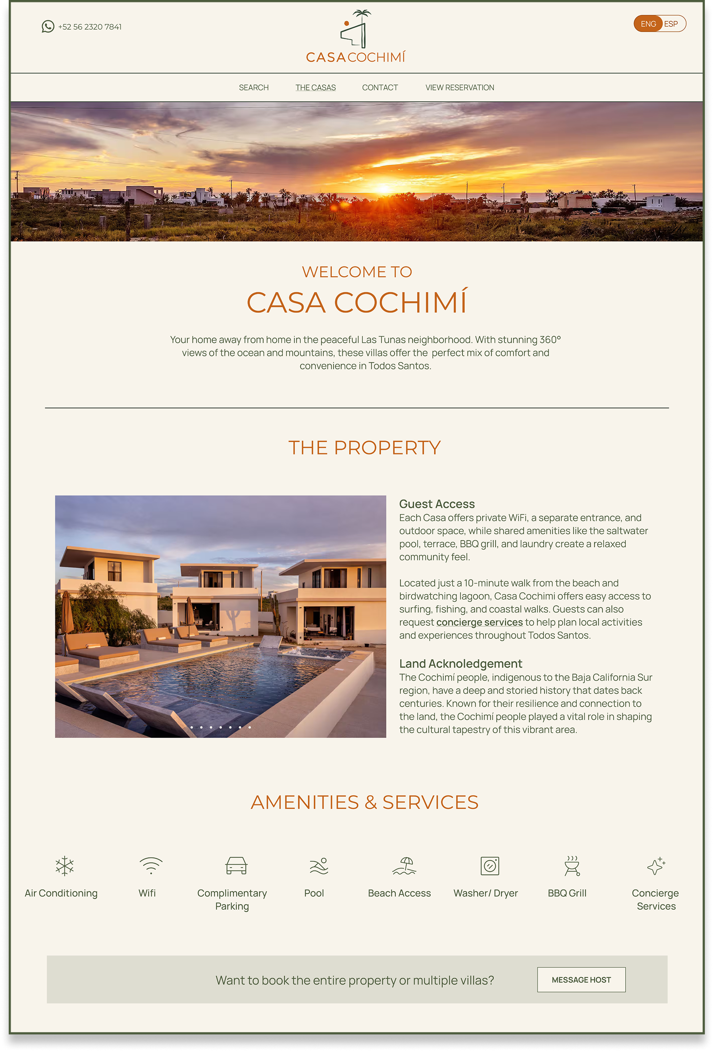
I designed a responsive desktop booking flow that enables travelers to discover Casa Cochimí, search available stays, compare property types, complete checkout, and access reservation details through a streamlined and visually cohesive platform.
OVERVIEW
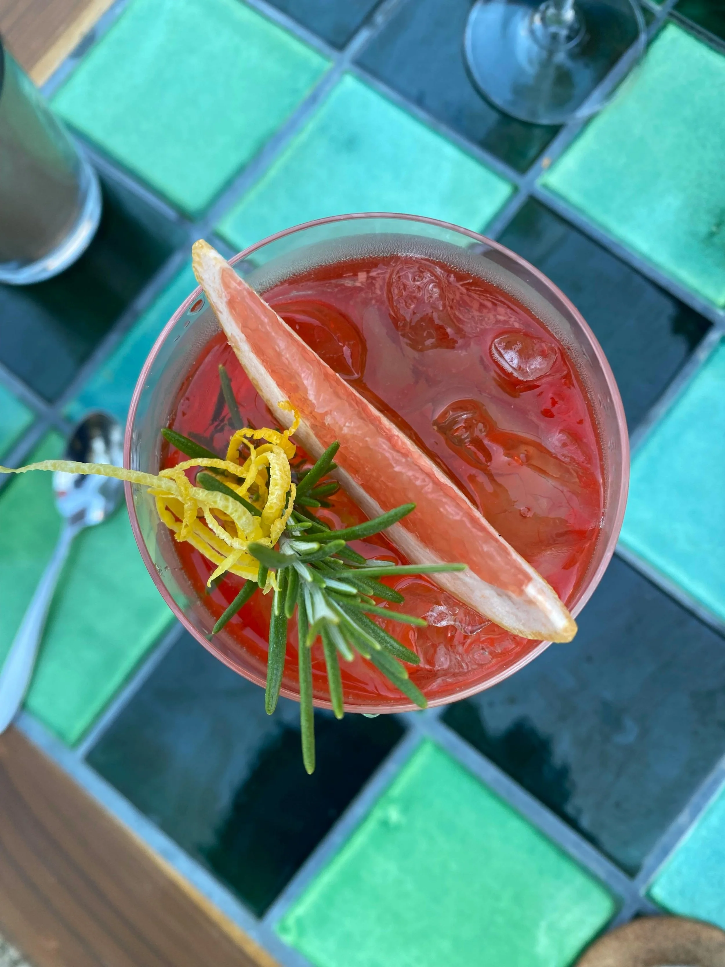
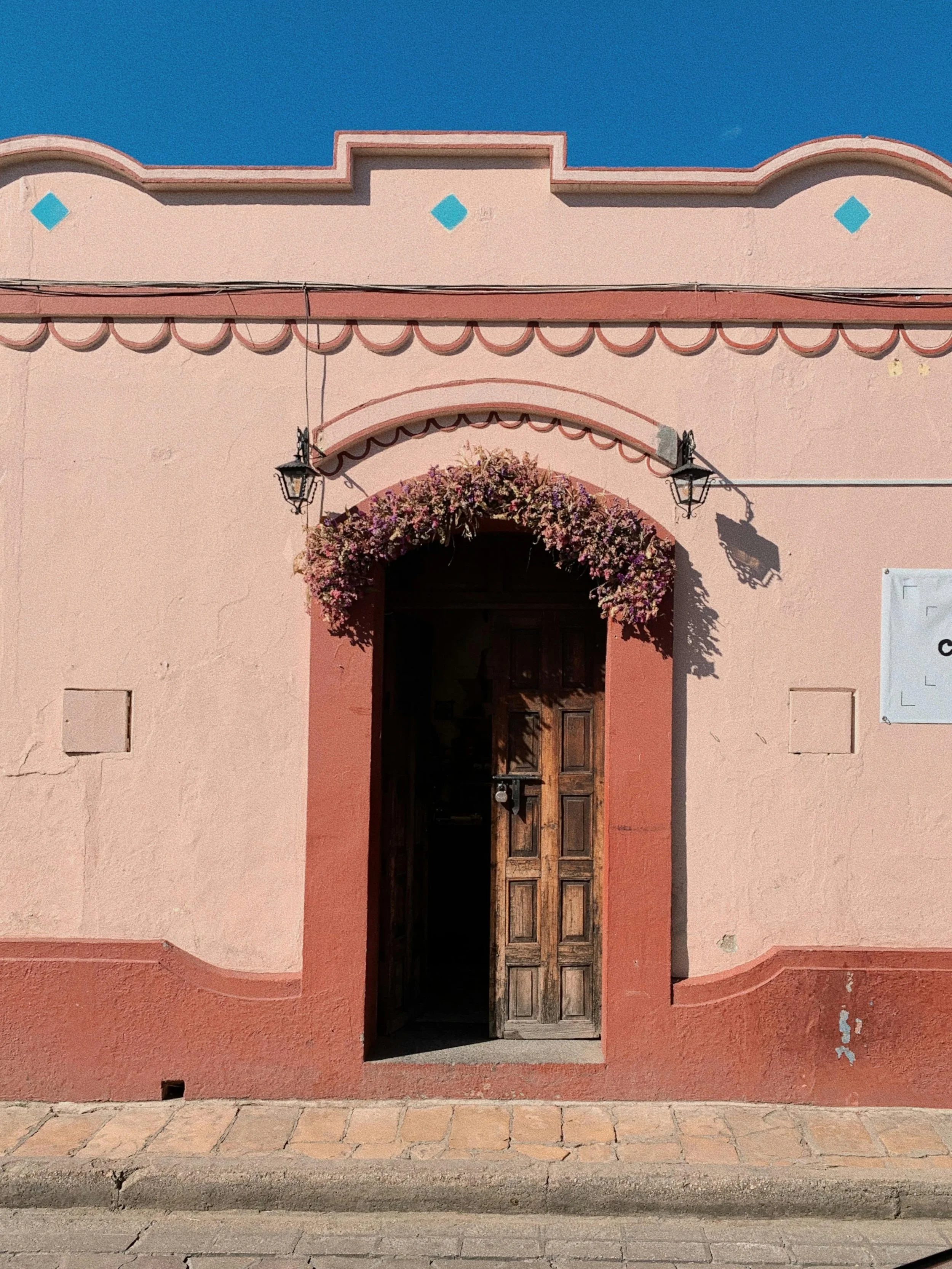
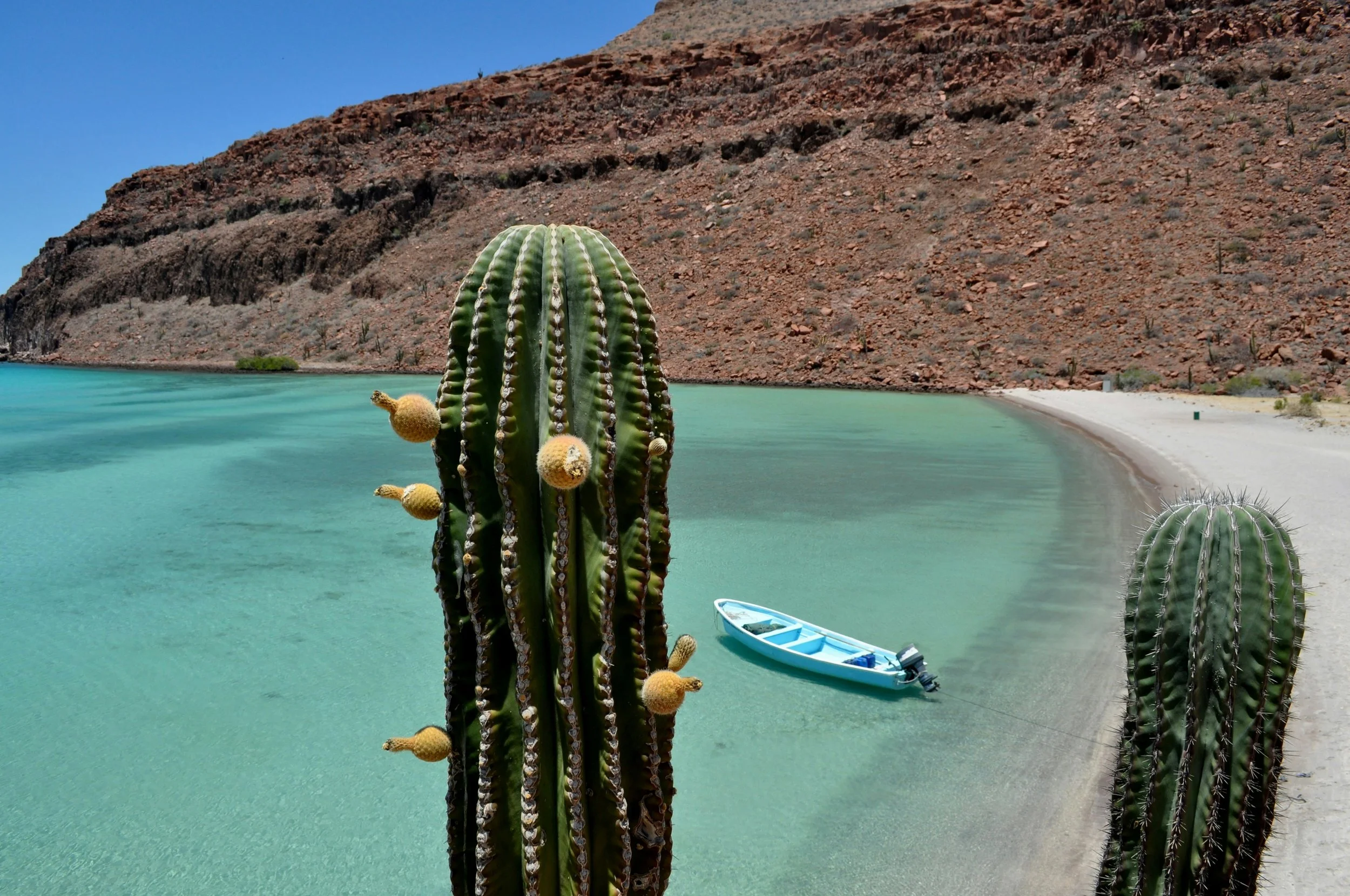
Casa Cochimí is a boutique vacation rental property located in Todos Santos, Mexico. The client imagined a dedicated website that would support direct bookings and provide guests with a more seamless reservation experience.
Working directly with the property owner, I designed an end-to-end desktop booking experience that allows users to search availability, compare casas, explore amenities, complete checkout, and manage reservations through a cohesive and intuitive experience.
*Branding, logo, and photography were provided by the client. My focus was on UX strategy, booking flow design, information architecture, and UI execution.


research


GOALS
Understand how travelers currently search, compare, and book vacation rentals
Identify mental models around booking flows, pricing transparency, and general communication
Learn what “luxury” or “premium experience” means for travelers
Identify frustrations with existing online travel agencies
Determine what builds trust for users
COMPETITIVE ANALYSIS
I analyzed competitors across multiple areas of the vacation rental industry, from large scale to curated luxury experiences. Rather than focusing only on direct competitors, I studied how different brands built trust, communicated value, simplified booking flows, and positioned their properties.

STRENGTHS
Familiar booking patterns that align with existing mental models — frictionless checkout
Strong photography and curated branding creates emotional connection
Transparent pricing, reviews, ratings, and policies increases trust and confidence
Elevated the perception of luxury — platforms with concierge style experiences and curated recommendations
Search and comparison tools
WEAKNESSES
Excessive listings and crowded interfaces creates overwhelm
Hidden fees appearing at later stages of checkout loses trust
Communication between guests and hosts can be limited
Luxury competitors can prioritize aesthetics over usability
Multiple platforms needs to fully understand a property and its surrounding areas
OPPORTUNITIES
Create a direct booking experience that combines the trust and familiarity of major booking platforms with the warmth and personality of a boutique hospitality brand
Reinforce transparency through clear pricing, reservation summaries, cancellation policies, and accessible host communication
Position Casa Cochimí as a curated destination experience rather than just a rental property — highlight local culture, guidebooks, and personalized hospitality
Use high quality imagery and minimal layouts to communicate luxury while maintaining intuitive usability
USER INTERVIEWS
I interviewed 5 travelers who travel domestically or internationally 3+ times a year. I wanted to understand how they search, compare, and book vacation rentals, as well as what builds trust during the reservation process.


“If the host has a fast response time, that gives me confidence”KEY INSIGHTS
Familiar booking patterns
Relying on previously established systems creates ease
First impressions are highly visual
Listings judged based on photography quality, cleanliness, decor, and overall aesthetic
Transparent pricing
Major frustrations with hidden fees and unexpected costs appearing late in the booking process
Visual credibility
Outdated interfaces, cluttered layouts, or unclear policies made users hesitant to book directly
Reviews and responsiveness
Increased confidence when communication is fast and reviews look reliable
“If website is updated and reviews are legit, I would book directly”DESIGN OPPORTUNITIES
Design a booking flow that follows familiar vacation rental mental models and reduces friction through intuitive navigation and clear information hierarchy
Prioritize large, editorial style photography and minimal layouts to create an elevated experience
Increase trust through transparent pricing, visible cancellation policies, integrated reviews, and professional visual design
Leverage Casa Cochimí as a more personal direct booking experience with clear host communication and approachable hospitality
define

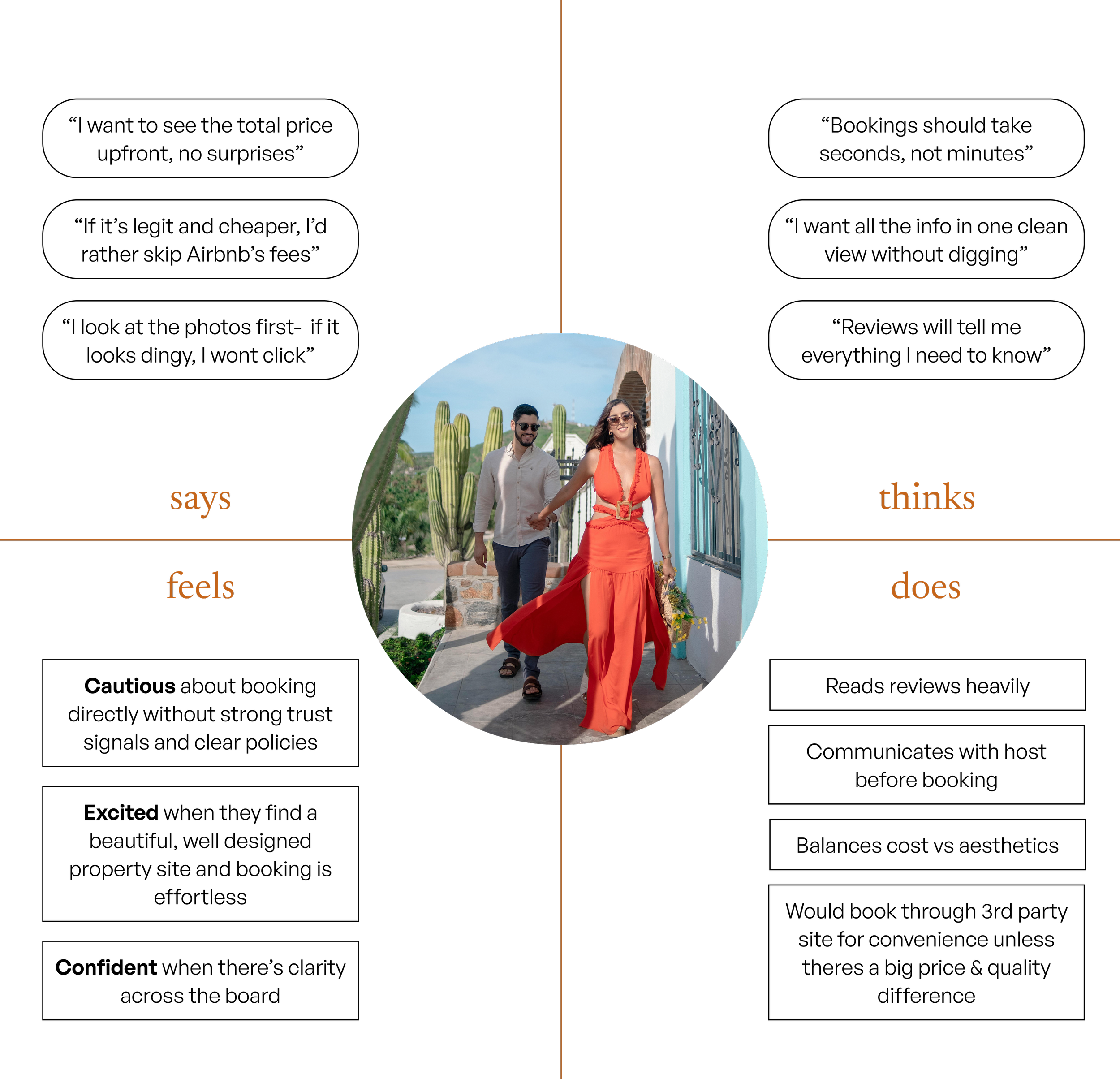
EMPATHY MAP
I chose to create an empathy map so I could better understand the travelers emotional journey. I wanted to answer the question — what leads them to make the choices they make during booking?
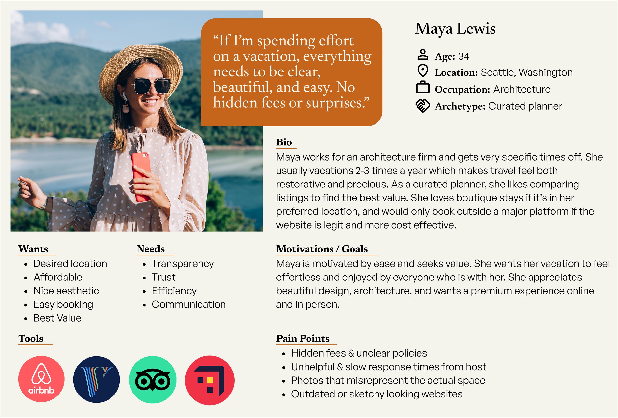
USER PERSONA
Users repeatedly emphasized that booking a vacation rental is about more than accommodations — it’s about reducing stress and feeling confident before arriving at the destination.

How might we combine the trust and familiarity of large booking platforms with the warmth and personalization of a boutique stay?

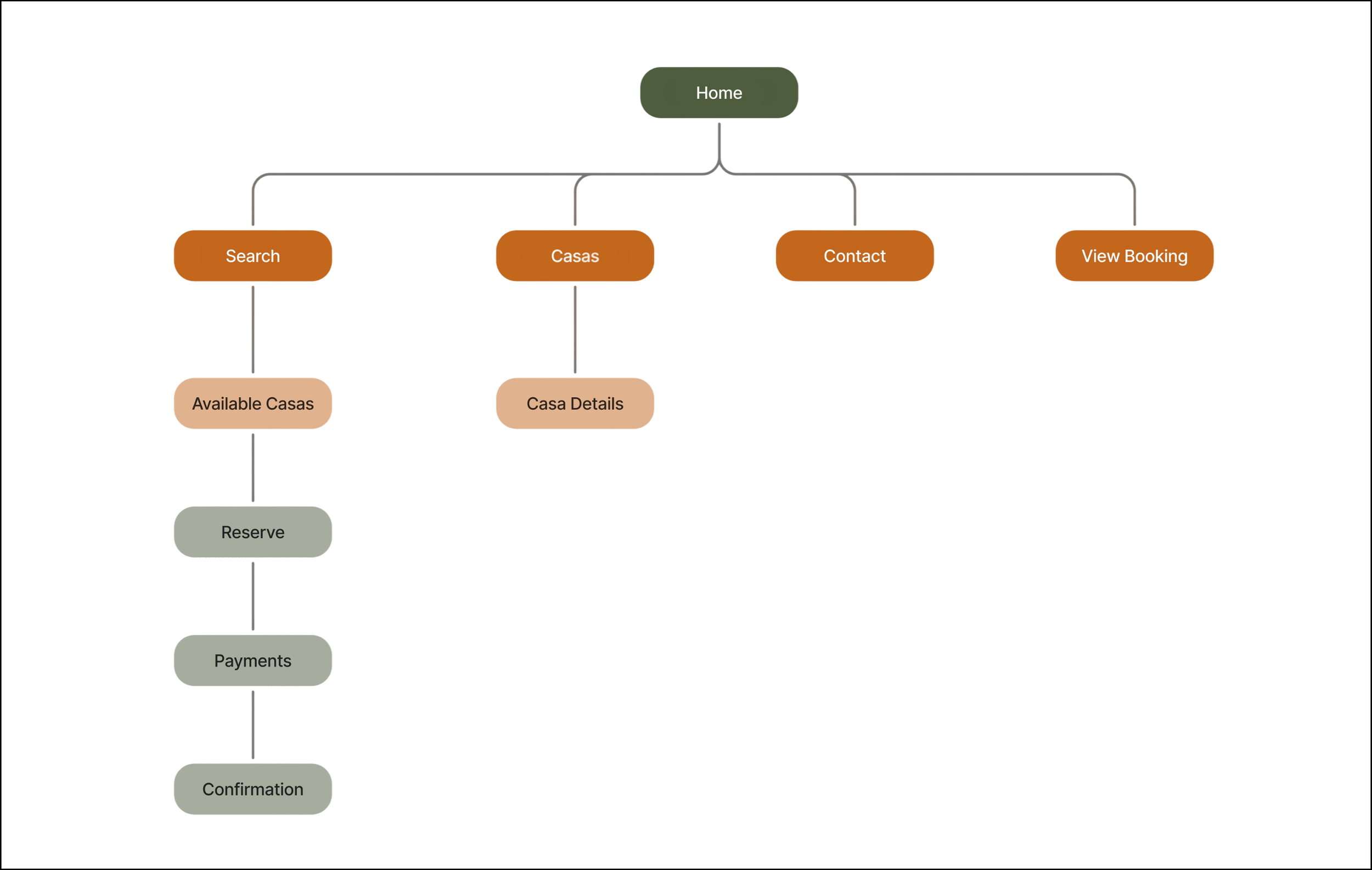
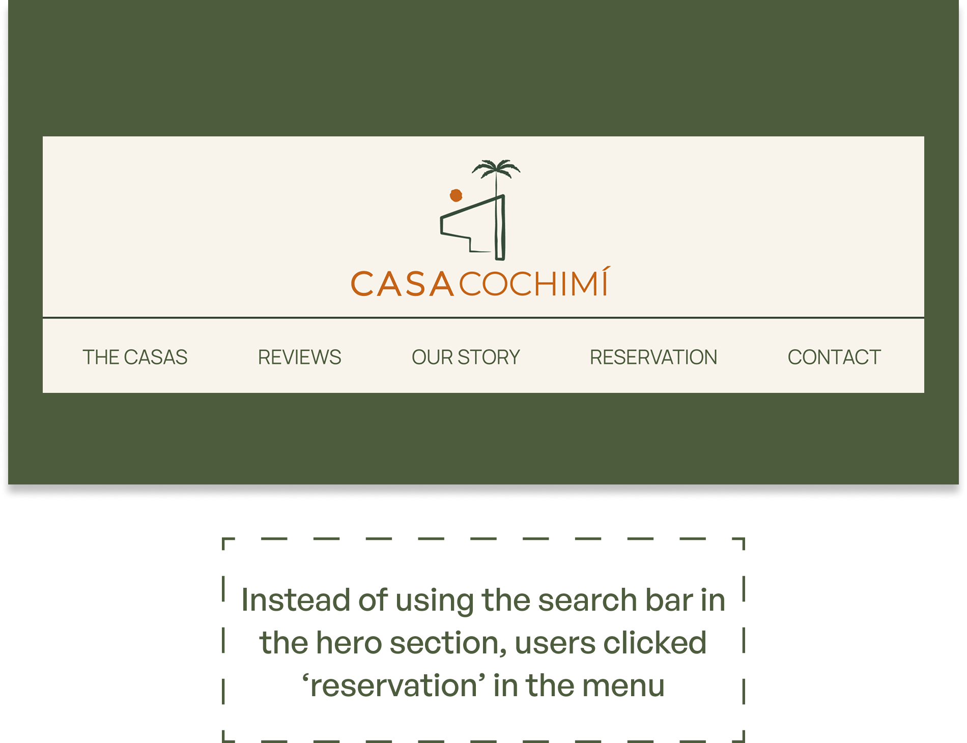
SITE MAP
My research showed that travelers primarily wanted to do three things quickly: check availability, compare casas, and feel confident enough to book directly. Therefore, I kept the site architecture lightweight and focused.
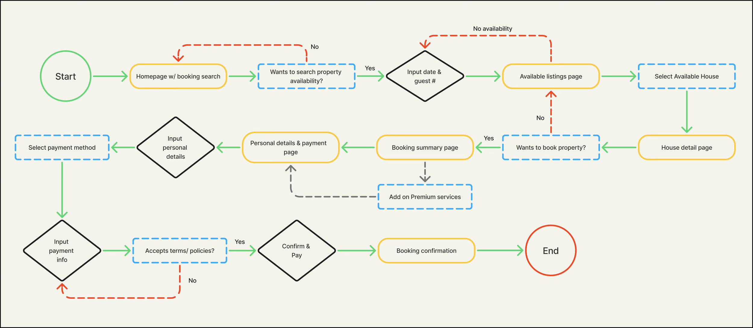
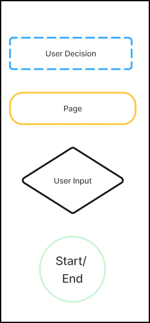
USER FLOW
One of the biggest insights from my research was that users were willing to book directly only if the process felt clear, predictable, and professional. The flow was designed to reinforce trust through clear confirmation steps and familiar checkout behaviors.
design

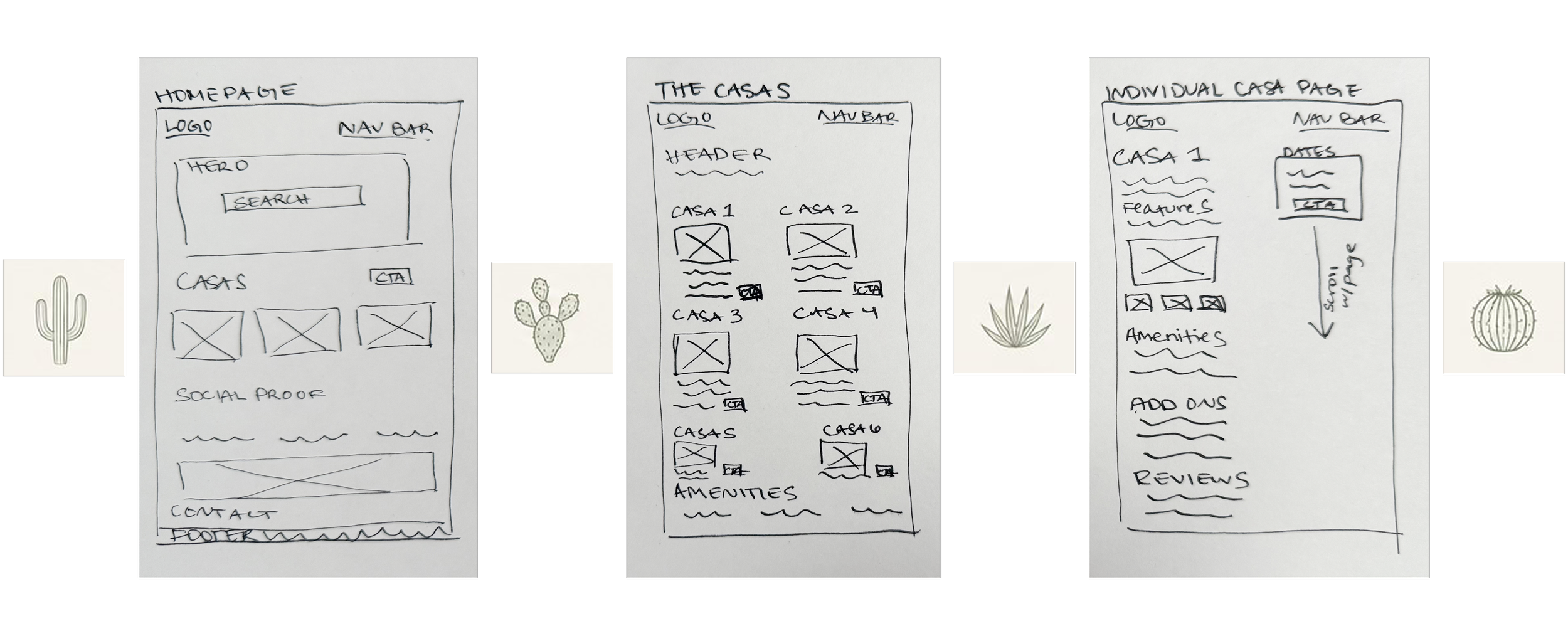
LOW FIDELITY WIREFRAMES
My low fidelity wireframes focused on the over all structure of presenting Casa Cohcimí with clarity and strongimagery. The individual casas page intuitively allows the user to enter dates and number of guests to begin the booking process.
BRANDING
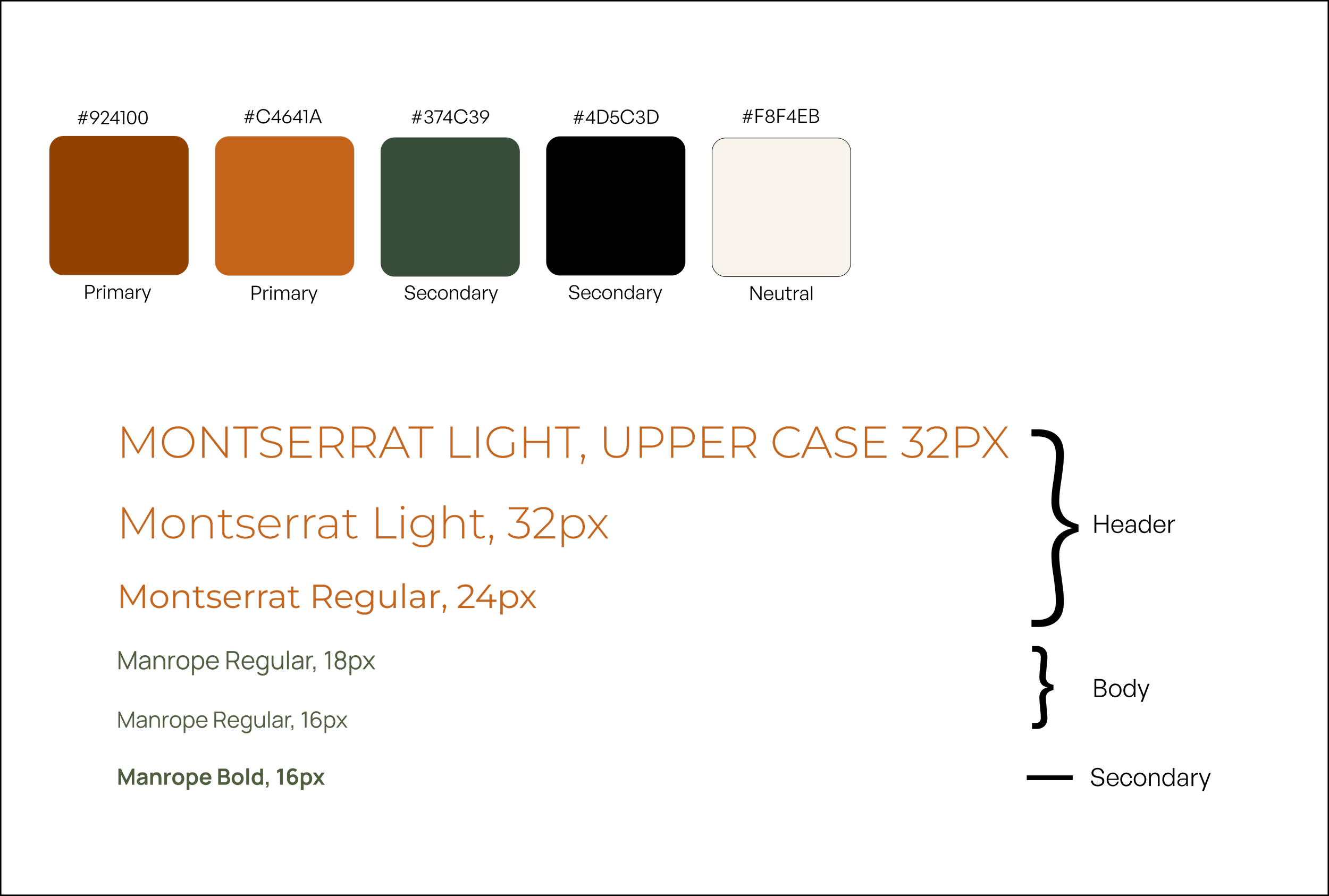
Casa Cochimí already had an established logo from which I created a color palette and expanded the visual system. My role was to translate the existing identity into a cohesive digital experience that felt warm and elevated.

testing

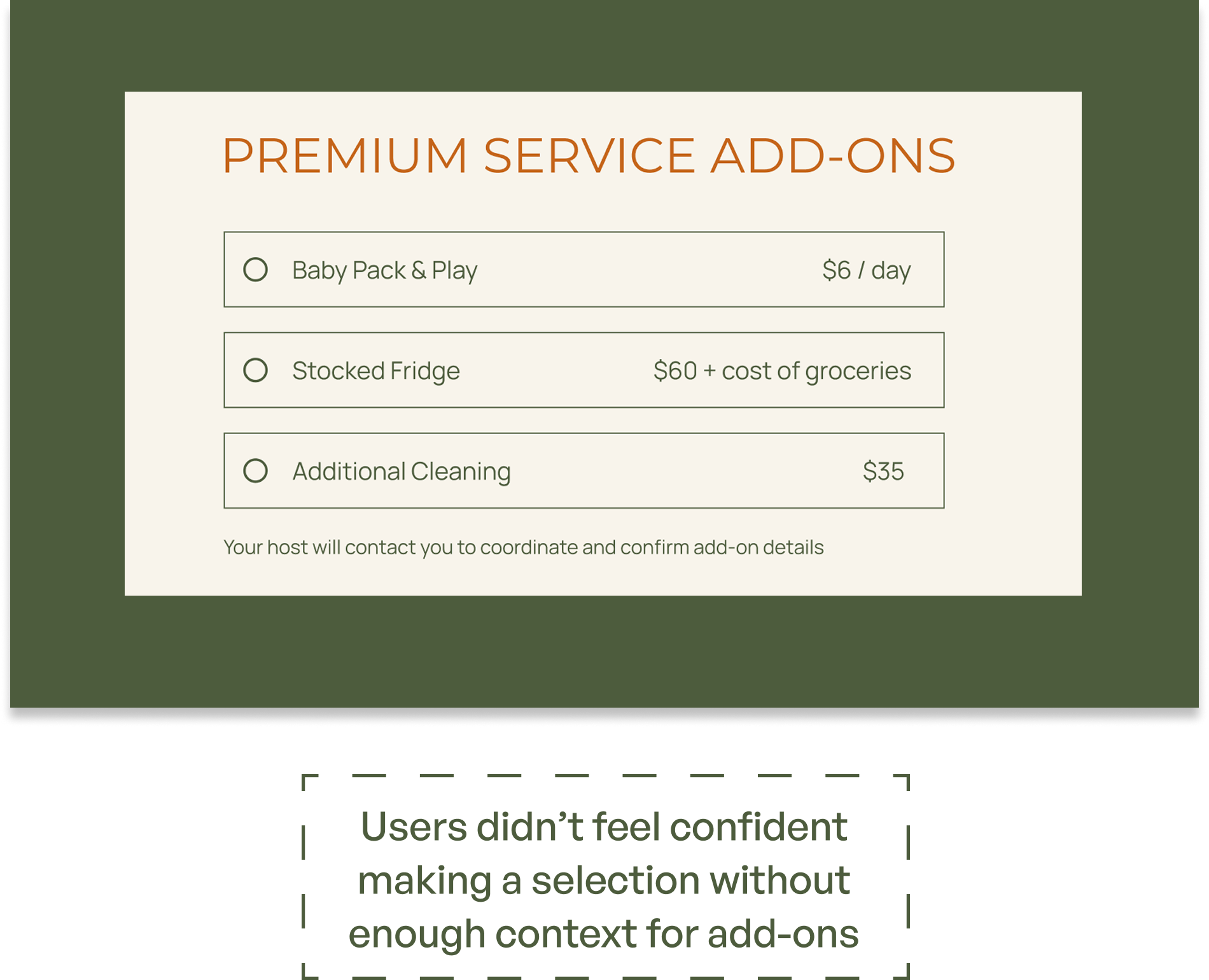
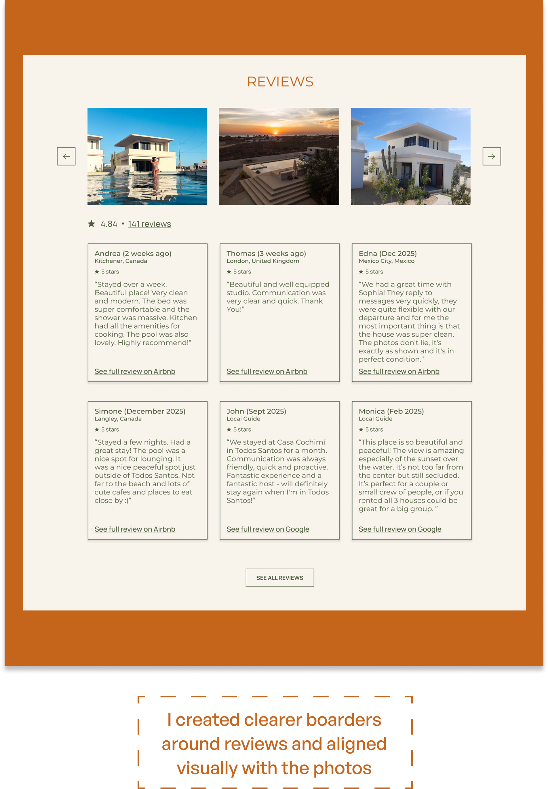
Testing validated that the booking experience felt intuitive and easy to navigate, with all 4 participants successfully completing the primary tasks. Rather than requiring major structural changes, feedback primarily highlighted opportunities to refine content clarity, strengthen information hierarchy, and better communicate Casa Cochimí’s property structure and available rental types.
BEFORE
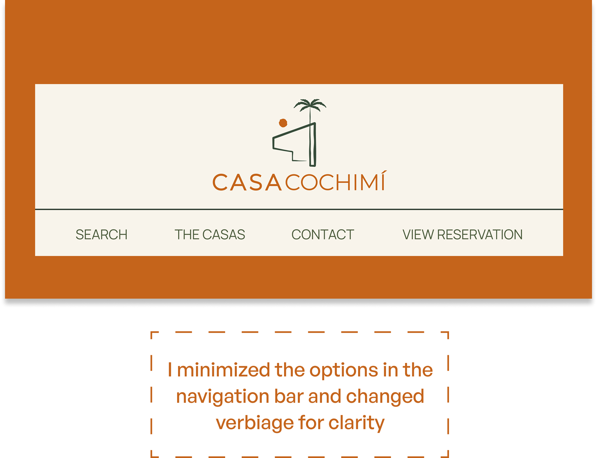
AFTER
BEFORE
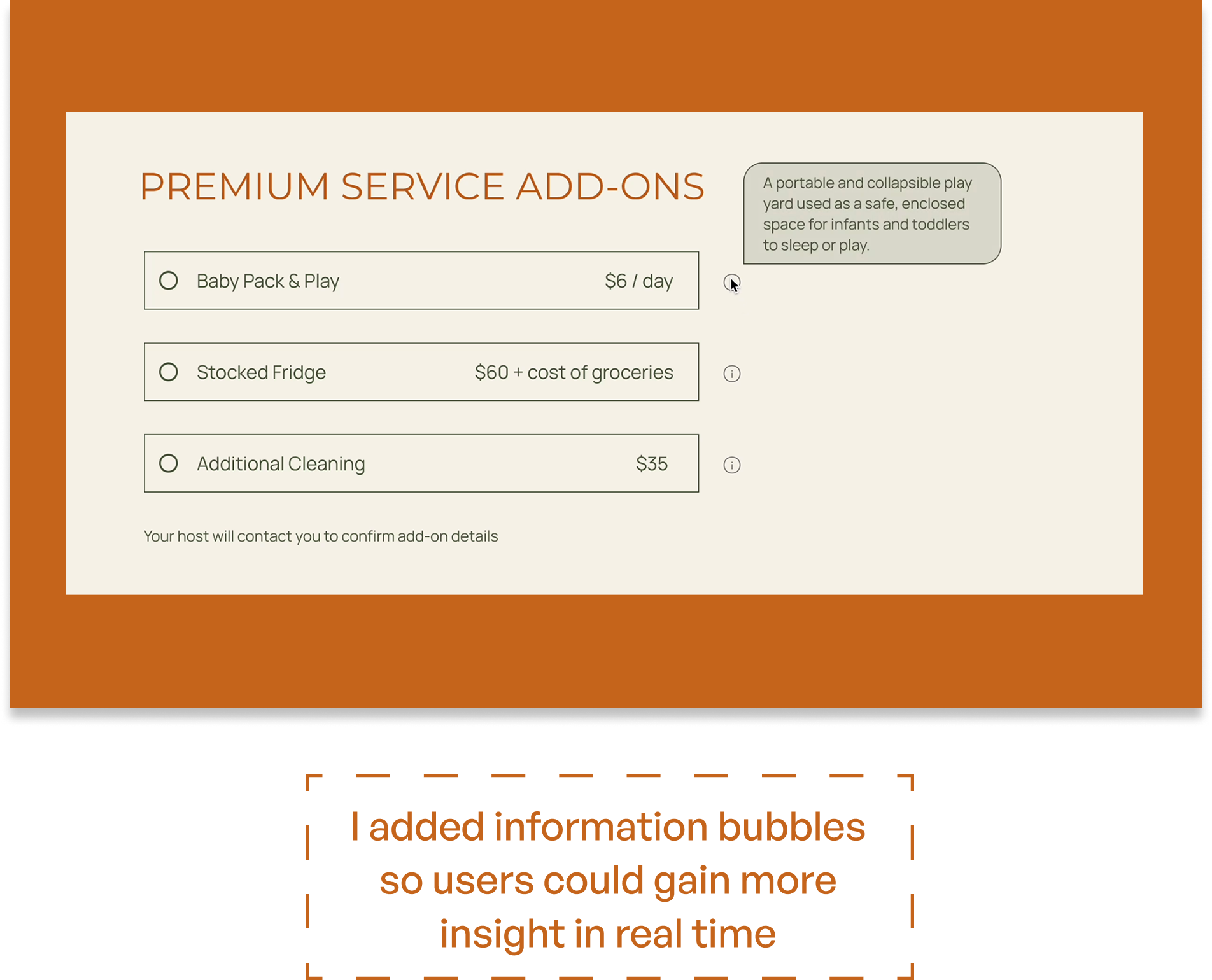
AFTER
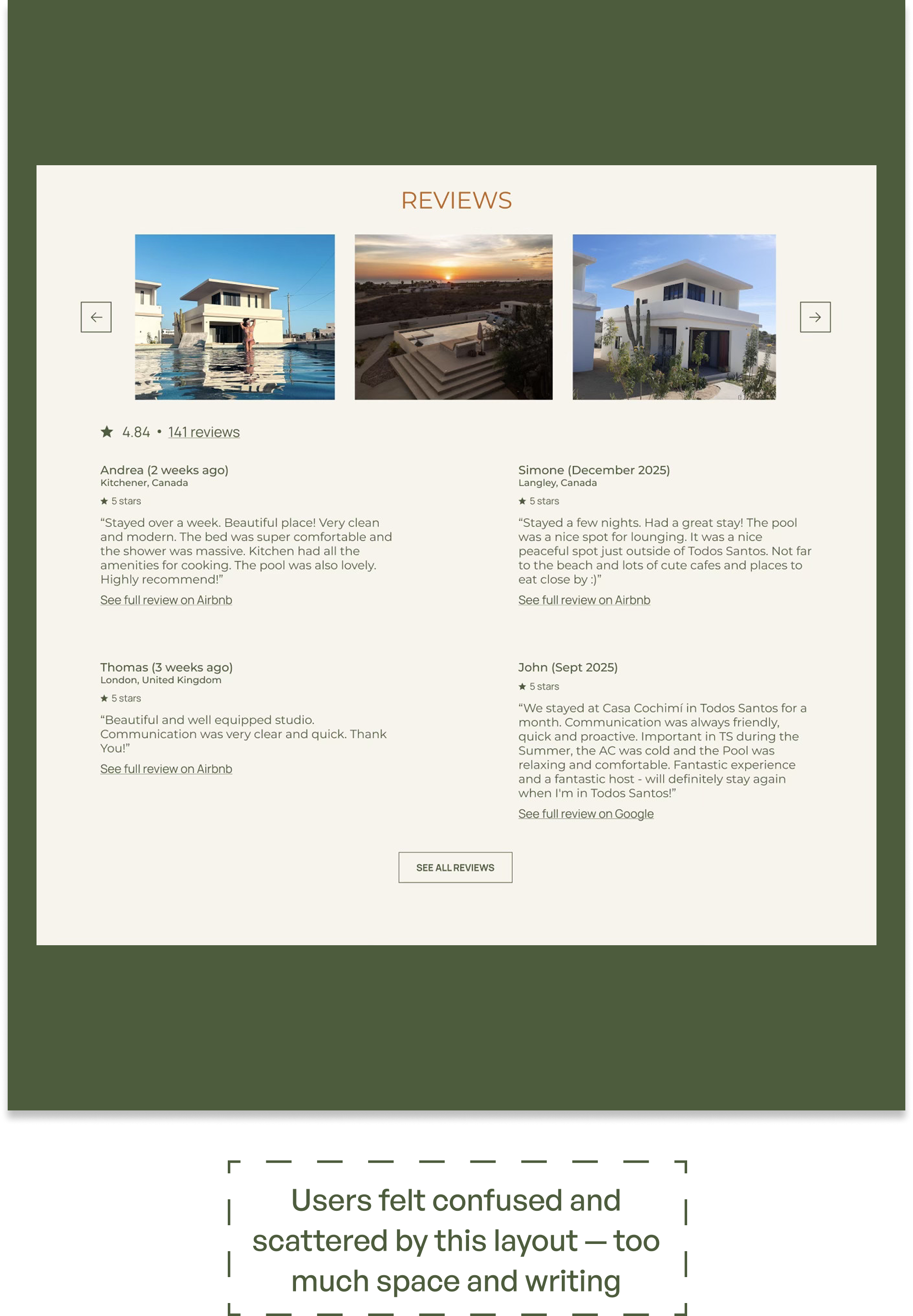
BEFORE
AFTER
KEY SCREENS

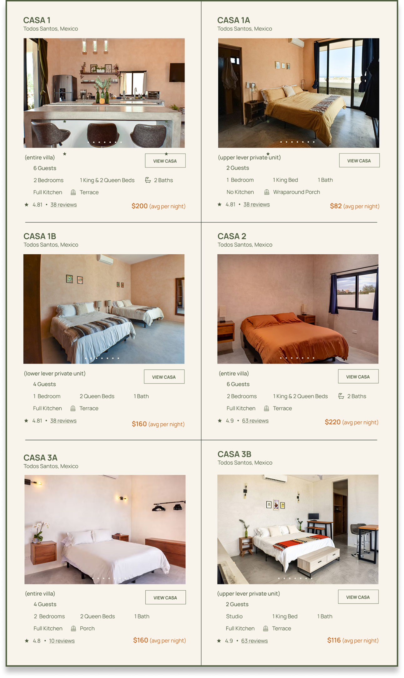

the final design
takeaways

WHAT DID I LEARN?
Working with a real client taught me how to balance user needs, business goals, and existing brand constraints at the same time. I had to focus on creating a cohesive experience within an existing visual system, communicate design decisions with stakeholders, incorporate client feedback, and iterate while keeping the overall user experience consistent.
WHAT WOULD I IMPROVE?
I would further refine the booking flow for edge cases such as unavailable dates, split payments, group bookings, or comparing multiple casas side by side. I would also expand the responsive experience beyond desktop to create a fully optimized mobile booking flow, since many travelers browse and book directly from their phones.
PERSONAL REFLECTION
This project pushed me beyond designing conceptual solutions and into collaborating with a real business owner with real goals, constraints, and feedback. It challenged me to think more strategically about how design supports both users and business outcomes.